
Author: Jason Brownlee
It can be more flexible to predict probabilities of an observation belonging to each class in a classification problem rather than predicting classes directly.
This flexibility comes from the way that probabilities may be interpreted using different thresholds that allow the operator of the model to trade-off concerns in the errors made by the model, such as the number of false positives compared to the number of false negatives. This is required when using models where the cost of one error outweighs the cost of other types of errors.
Two diagnostic tools that help in the interpretation of probabilistic forecast for binary (two-class) classification predictive modeling problems are ROC Curves and Precision-Recall curves.
In this tutorial, you will discover ROC Curves, Precision-Recall Curves, and when to use each to interpret the prediction of probabilities for binary classification problems.
After completing this tutorial, you will know:
- ROC Curves summarize the trade-off between the true positive rate and false positive rate for a predictive model using different probability thresholds.
- Precision-Recall curves summarize the trade-off between the true positive rate and the positive predictive value for a predictive model using different probability thresholds.
- ROC curves are appropriate when the observations are balanced between each class, whereas precision-recall curves are appropriate for imbalanced datasets.
Let’s get started.
- Update Aug/2018: Fixed bug in the representation of the no skill line for the precision-recall plot.

How and When to Use ROC Curves and Precision-Recall Curves for Classification in Python
Photo by Giuseppe Milo, some rights reserved.
Tutorial Overview
This tutorial is divided into 6 parts; they are:
- Predicting Probabilities
- What Are ROC Curves?
- ROC Curves and AUC in Python
- What Are Precision-Recall Curves?
- Precision-Recall Curves and AUC in Python
- When to Use ROC vs. Precision-Recall Curves?
Predicting Probabilities
In a classification problem, we may decide to predict the class values directly.
Alternately, it can be more flexible to predict the probabilities for each class instead. The reason for this is to provide the capability to choose and even calibrate the threshold for how to interpret the predicted probabilities.
For example, a default might be to use a threshold of 0.5, meaning that a probability in [0.0, 0.49] is a negative outcome (0) and a probability in [0.5, 1.0] is a positive outcome (1).
This threshold can be adjusted to tune the behavior of the model for a specific problem. An example would be to reduce more of one or another type of error.
When making a prediction for a binary or two-class classification problem, there are two types of errors that we could make.
- False Positive. Predict an event when there was no event.
- False Negative. Predict no event when in fact there was an event.
By predicting probabilities and calibrating a threshold, a balance of these two concerns can be chosen by the operator of the model.
For example, in a smog prediction system, we may be far more concerned with having low false negatives than low false positives. A false negative would mean not warning about a smog day when in fact it is a high smog day, leading to health issues in the public that are unable to take precautions. A false positive means the public would take precautionary measures when they didn’t need to.
A common way to compare models that predict probabilities for two-class problems us to use a ROC curve.
What Are ROC Curves?
A useful tool when predicting the probability of a binary outcome is the Relative Operating Characteristic curve, or ROC curve.
It is a plot of the false positive rate (x-axis) versus the true positive rate (y-axis) for a number of different candidate threshold values between 0.0 and 1.0. Put another way, it plots the false alarm rate versus the hit rate.
The true positive rate is calculated as the number of true positives divided by the sum of the number of true positives and the number of false negatives. It describes how good the model is at predicting the positive class when the actual outcome is positive.
True Positive Rate = True Positives / (True Positives + False Negatives)
The true positive rate is also referred to as sensitivity.
Sensitivity = True Positives / (True Positives + False Negatives)
The false positive rate is calculated as the number of false positives divided by the sum of the number of false positives and the number of true negatives.
It is also called the false alarm rate as it summarizes how often a positive class is predicted when the actual outcome is negative.
False Positive Rate = False Positives / (False Positives + True Negatives)
The false positive rate is also referred to as the inverted specificity where specificity is the total number of true negatives divided by the sum of the number of true negatives and false positives.
Specificity = True Negatives / (True Negatives + False Positives)
Where:
False Positive Rate = 1 - Specificity
The ROC curve is a useful tool for a few reasons:
- The curves of different models can be compared directly in general or for different thresholds.
- The area under the curve (AUC) can be used as a summary of the model skill.
The shape of the curve contains a lot of information, including what we might care about most for a problem, the expected false positive rate, and the false negative rate.
To make this clear:
- Larger values on the x-axis of the plot indicate higher true positives and lower false negatives.
- Smaller values on the y-axis of the plot indicate lower false positives and higher true negatives.
If you are confused, remember, when we predict a binary outcome, it is either a correct prediction (true positive) or not (false positive). There is a tension between these options, the same with true negative and false positives.
A skilful model will assign a higher probability to a randomly chosen real positive occurrence than a negative occurrence on average. This is what we mean when we say that the model has skill. Generally, skilful models are represented by curves that bow up to the top left of the plot.
A model with no skill is represented at the point [0.5, 0.5]. A model with no skill at each threshold is represented by a diagonal line from the bottom left of the plot to the top right and has an AUC of 0.0.
A model with perfect skill is represented at a point [0.0 ,1.0]. A model with perfect skill is represented by a line that travels from the bottom left of the plot to the top left and then across the top to the top right.
An operator may plot the ROC curve for the final model and choose a threshold that gives a desirable balance between the false positives and false negatives.
ROC Curves and AUC in Python
We can plot a ROC curve for a model in Python using the roc_curve() scikit-learn function.
The function takes both the true outcomes (0,1) from the test set and the predicted probabilities for the 1 class. The function returns the false positive rates for each threshold, true positive rates for each threshold and thresholds.
# calculate roc curve
fpr, tpr, thresholds = roc_curve(y, probs)
The AUC for the ROC can be calculated using the roc_auc_score() function.
Like the roc_curve() function, the AUC function takes both the true outcomes (0,1) from the test set and the predicted probabilities for the 1 class. It returns the AUC score between 0.0 and 1.0 for no skill and perfect skill respectively.
# calculate AUC
auc = roc_auc_score(y, probs)
print('AUC: %.3f' % auc)
A complete example of calculating the ROC curve and AUC for a logistic regression model on a small test problem is listed below.
# roc curve and auc
from sklearn.datasets import make_classification
from sklearn.neighbors import KNeighborsClassifier
from sklearn.model_selection import train_test_split
from sklearn.metrics import roc_curve
from sklearn.metrics import roc_auc_score
from matplotlib import pyplot
# generate 2 class dataset
X, y = make_classification(n_samples=1000, n_classes=2, weights=[1,1], random_state=1)
# split into train/test sets
trainX, testX, trainy, testy = train_test_split(X, y, test_size=0.5, random_state=2)
# fit a model
model = KNeighborsClassifier(n_neighbors=3)
model.fit(trainX, trainy)
# predict probabilities
probs = model.predict_proba(testX)
# keep probabilities for the positive outcome only
probs = probs[:, 1]
# calculate AUC
auc = roc_auc_score(testy, probs)
print('AUC: %.3f' % auc)
# calculate roc curve
fpr, tpr, thresholds = roc_curve(testy, probs)
# plot no skill
pyplot.plot([0, 1], [0, 1], linestyle='--')
# plot the roc curve for the model
pyplot.plot(fpr, tpr, marker='.')
# show the plot
pyplot.show()
Running the example prints the area under the ROC curve.
AUC: 0.895
A plot of the ROC curve for the model is also created showing that the model has skill.
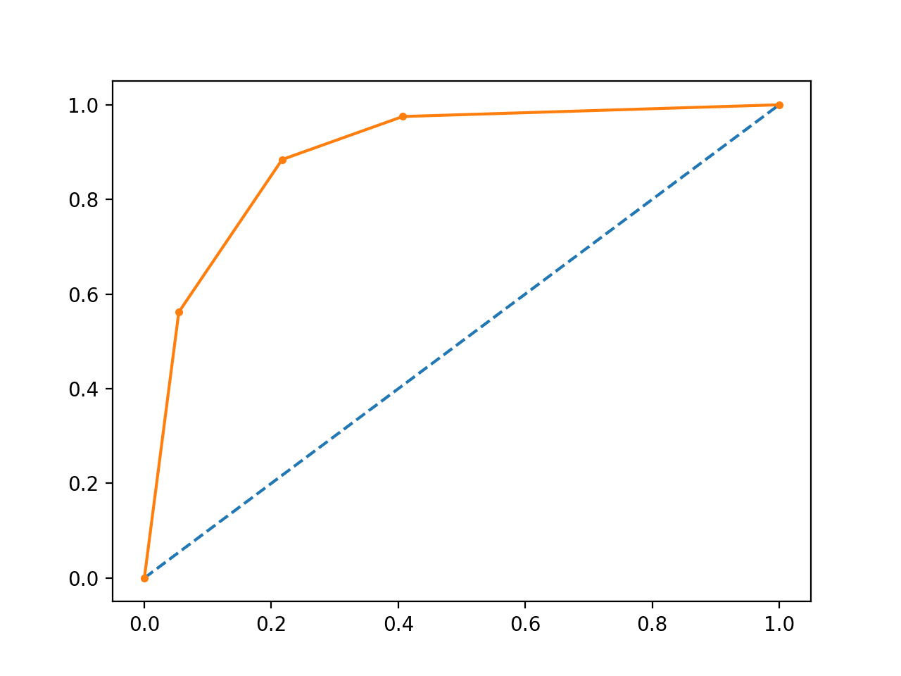
Line Plot of ROC Curve
What Are Precision-Recall Curves?
There are many ways to evaluate the skill of a prediction model.
An approach in the related field of information retrieval (finding documents based on queries) measures precision and recall.
These measures are also useful in applied machine learning for evaluating binary classification models.
Precision is a ratio of the number of true positives divided by the sum of the true positives and false positives. It describes how good a model is at predicting the positive class. Precision is referred to as the positive predictive value.
Positive Predictive Power = True Positives / (True Positives + False Positives)
or
Precision = True Positives / (True Positives + False Positives)
Recall is calculated as the ratio of the number of true positives divided by the sum of the true positives and the false negatives. Recall is the same as sensitivity.
Recall = True Positives / (True Positives + False Negatives)
or
Sensitivity = True Positives / (True Positives + False Negatives)
Recall == Sensitivity
Reviewing both precision and recall is useful in cases where there is an imbalance in the observations between the two classes. Specifically, there are many examples of no event (class 0) and only a few examples of an event (class 1).
The reason for this is that typically the large number of class 0 examples means we are less interested in the skill of the model at predicting class 0 correctly, e.g. high true negatives.
Key to the calculation of precision and recall is that the calculations do not make use of the true negatives. It is only concerned with the correct prediction of the minority class, class 1.
A precision-recall curve is a plot of the precision (y-axis) and the recall (x-axis) for different thresholds, much like the ROC curve.
The no-skill line is defined by the total number of positive cases divide by the total number of positive and negative cases. For a dataset with an equal number of positive and negative cases, this is a straight line at 0.5. Points above this line show skill.
A model with perfect skill is depicted as a point at [1.0,1.0]. A skilful model is represented by a curve that bows towards [1.0,1.0] above the flat line of no skill.
There are also composite scores that attempt to summarize the precision and recall; three examples include:
- F score or F1 score: that calculates the harmonic mean of the precision and recall (harmonic mean because the precision and recall are ratios).
- Average precision: that summarizes the weighted increase in precision with each change in recall for the thresholds in the precision-recall curve.
- Area Under Curve: like the AUC, summarizes the integral or an approximation of the area under the precision-recall curve.
In terms of model selection, F1 summarizes model skill for a specific probability threshold, whereas average precision and area under curve summarize the skill of a model across thresholds, like ROC AUC.
This makes precision-recall and a plot of precision vs. recall and summary measures useful tools for binary classification problems that have an imbalance in the observations for each class.
Precision-Recall Curves in Python
Precision and recall can be calculated in scikit-learn via the precision_score() and recall_score() functions.
The precision and recall can be calculated for thresholds using the precision_recall_curve() function that takes the true output values and the probabilities for the positive class as output and returns the precision, recall and threshold values.
# calculate precision-recall curve
precision, recall, thresholds = precision_recall_curve(testy, probs)
The F1 score can be calculated by calling the f1_score() function that takes the true class values and the predicted class values as arguments.
# calculate F1 score
f1 = f1_score(testy, yhat)
The area under the precision-recall curve can be approximated by calling the auc() function and passing it the recall and precision values calculated for each threshold.
# calculate precision-recall AUC
auc = auc(recall, precision)
Finally, the average precision can be calculated by calling the average_precision_score() function and passing it the true class values and the predicted class values.
The complete example is listed below.
# precision-recall curve and f1
from sklearn.datasets import make_classification
from sklearn.neighbors import KNeighborsClassifier
from sklearn.model_selection import train_test_split
from sklearn.metrics import precision_recall_curve
from sklearn.metrics import f1_score
from sklearn.metrics import auc
from sklearn.metrics import average_precision_score
from matplotlib import pyplot
# generate 2 class dataset
X, y = make_classification(n_samples=1000, n_classes=2, weights=[1,1], random_state=1)
# split into train/test sets
trainX, testX, trainy, testy = train_test_split(X, y, test_size=0.5, random_state=2)
# fit a model
model = KNeighborsClassifier(n_neighbors=3)
model.fit(trainX, trainy)
# predict probabilities
probs = model.predict_proba(testX)
# keep probabilities for the positive outcome only
probs = probs[:, 1]
# predict class values
yhat = model.predict(testX)
# calculate precision-recall curve
precision, recall, thresholds = precision_recall_curve(testy, probs)
# calculate F1 score
f1 = f1_score(testy, yhat)
# calculate precision-recall AUC
auc = auc(recall, precision)
# calculate average precision score
ap = average_precision_score(testy, probs)
print('f1=%.3f auc=%.3f ap=%.3f' % (f1, auc, ap))
# plot no skill
pyplot.plot([0, 1], [0.5, 0.5], linestyle='--')
# plot the roc curve for the model
pyplot.plot(recall, precision, marker='.')
# show the plot
pyplot.show()
Running the example first prints the F1, area under curve (AUC) and average precision (AP) scores.
f1=0.836 auc=0.892 ap=0.840
The precision-recall curve plot is then created showing the precision/recall for each threshold compared to a no skill model.
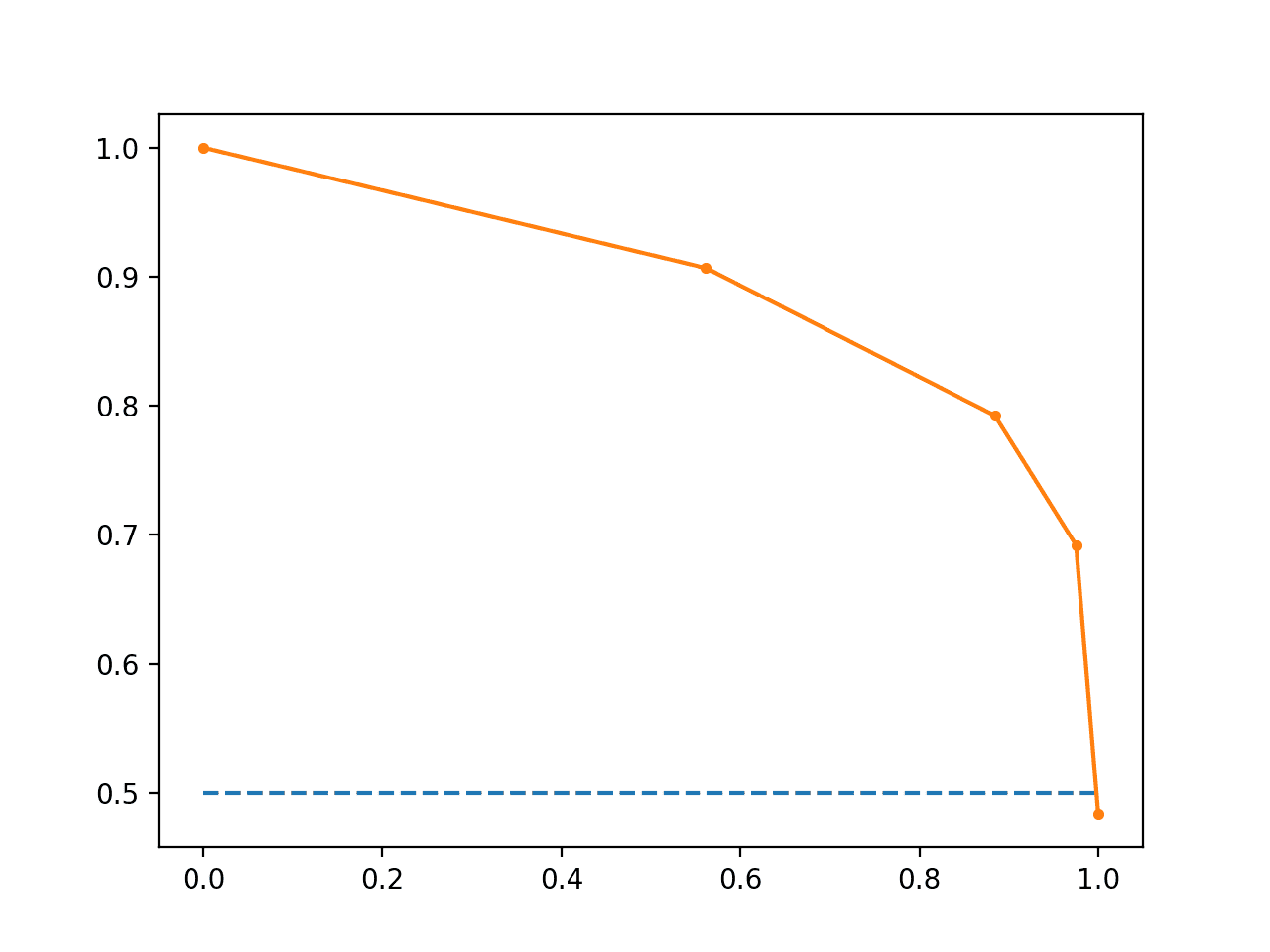
Line Plot of Precision-Recall Curve
When to Use ROC vs. Precision-Recall Curves?
Generally, the use of ROC curves and precision-recall curves are as follows:
- ROC curves should be used when there are roughly equal numbers of observations for each class.
- Precision-Recall curves should be used when there is a moderate to large class imbalance.
The reason for this recommendation is that ROC curves present an optimistic picture of the model on datasets with a class imbalance.
However, ROC curves can present an overly optimistic view of an algorithm’s performance if there is a large skew in the class distribution. […] Precision-Recall (PR) curves, often used in Information Retrieval , have been cited as an alternative to ROC curves for tasks with a large skew in the class distribution.
— The Relationship Between Precision-Recall and ROC Curves, 2006.
Some go further and suggest that using a ROC curve with an imbalanced dataset might be deceptive and lead to incorrect interpretations of the model skill.
[…] the visual interpretability of ROC plots in the context of imbalanced datasets can be deceptive with respect to conclusions about the reliability of classification performance, owing to an intuitive but wrong interpretation of specificity. [Precision-recall curve] plots, on the other hand, can provide the viewer with an accurate prediction of future classification performance due to the fact that they evaluate the fraction of true positives among positive predictions
The main reason for this optimistic picture is because of the use of true negatives in the False Positive Rate in the ROC Curve and the careful avoidance of this rate in the Precision-Recall curve.
If the proportion of positive to negative instances changes in a test set, the ROC curves will not change. Metrics such as accuracy, precision, lift and F scores use values from both columns of the confusion matrix. As a class distribution changes these measures will change as well, even if the fundamental classifier performance does not. ROC graphs are based upon TP rate and FP rate, in which each dimension is a strict columnar ratio, so do not depend on class distributions.
— ROC Graphs: Notes and Practical Considerations for Data Mining Researchers, 2003.
We can make this concrete with a short example.
Below is the same ROC Curve example with a modified problem where there is a 10:1 ratio of class=0 to class=1 observations.
# roc curve and auc on imbalanced dataset
from sklearn.datasets import make_classification
from sklearn.neighbors import KNeighborsClassifier
from sklearn.model_selection import train_test_split
from sklearn.metrics import roc_curve
from sklearn.metrics import roc_auc_score
from matplotlib import pyplot
# generate 2 class dataset
X, y = make_classification(n_samples=1000, n_classes=2, weights=[0.9,0.09], random_state=1)
# split into train/test sets
trainX, testX, trainy, testy = train_test_split(X, y, test_size=0.5, random_state=2)
# fit a model
model = KNeighborsClassifier(n_neighbors=3)
model.fit(trainX, trainy)
# predict probabilities
probs = model.predict_proba(testX)
# keep probabilities for the positive outcome only
probs = probs[:, 1]
# calculate AUC
auc = roc_auc_score(testy, probs)
print('AUC: %.3f' % auc)
# calculate roc curve
fpr, tpr, thresholds = roc_curve(testy, probs)
# plot no skill
pyplot.plot([0, 1], [0, 1], linestyle='--')
# plot the roc curve for the model
pyplot.plot(fpr, tpr, marker='.')
# show the plot
pyplot.show()
Running the example suggests that the model has skill.
AUC: 0.713
Indeed, it has skill, but much of that skill is measured as making correct false negative predictions and there are a lot of false negative predictions to make.
A plot of the ROC Curve confirms the AUC interpretation of a skilful model for most probability thresholds.
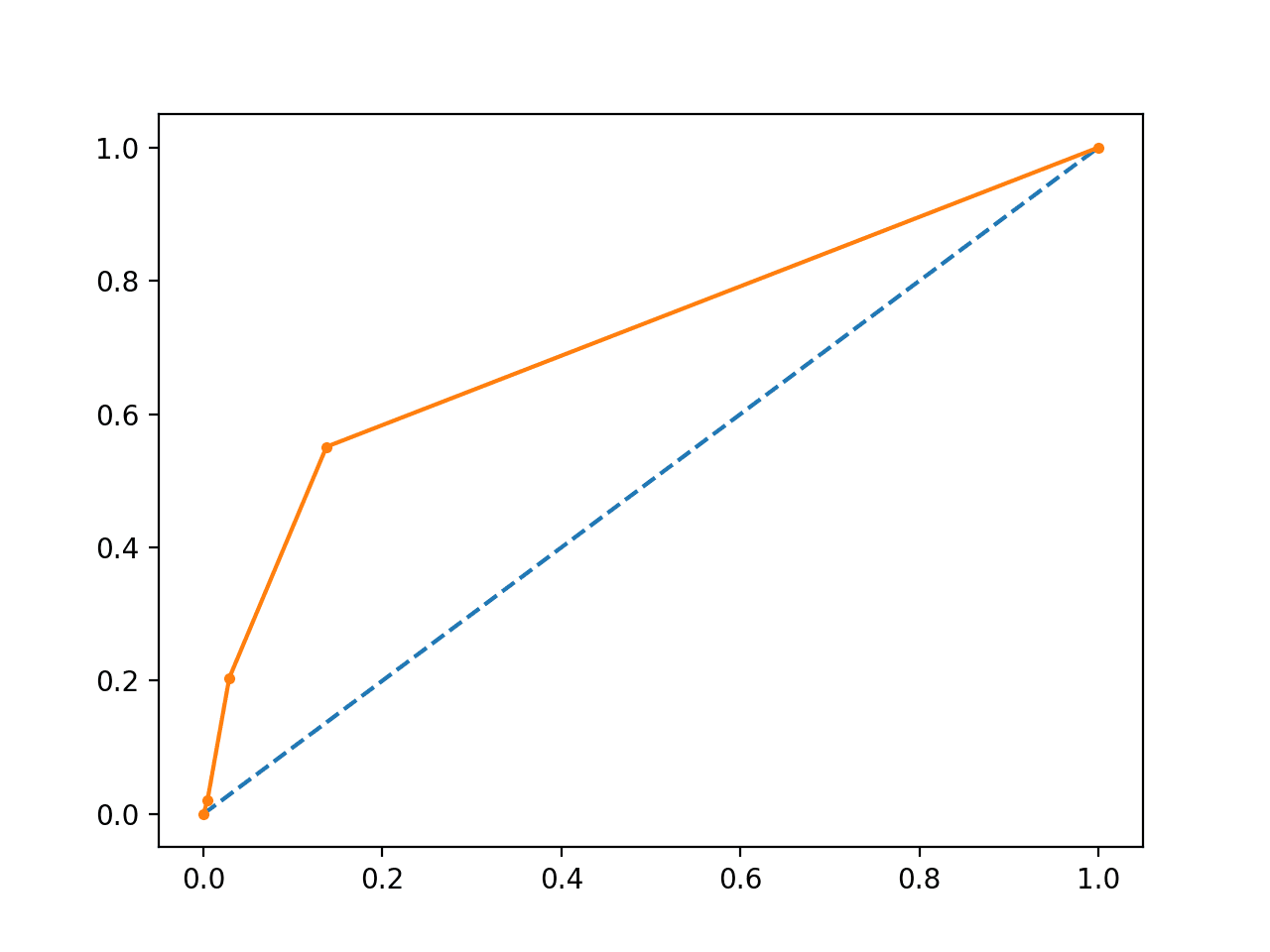
Line Plot of ROC Curve Imbalanced Dataset
We can also repeat the test of the same model on the same dataset and calculate a precision-recall curve and statistics instead.
The complete example is listed below.
# precision-recall curve and auc
from sklearn.datasets import make_classification
from sklearn.neighbors import KNeighborsClassifier
from sklearn.model_selection import train_test_split
from sklearn.metrics import precision_recall_curve
from sklearn.metrics import f1_score
from sklearn.metrics import auc
from sklearn.metrics import average_precision_score
from matplotlib import pyplot
# generate 2 class dataset
X, y = make_classification(n_samples=1000, n_classes=2, weights=[0.9,0.09], random_state=1)
# split into train/test sets
trainX, testX, trainy, testy = train_test_split(X, y, test_size=0.5, random_state=2)
# fit a model
model = KNeighborsClassifier(n_neighbors=3)
model.fit(trainX, trainy)
# predict probabilities
probs = model.predict_proba(testX)
# keep probabilities for the positive outcome only
probs = probs[:, 1]
# predict class values
yhat = model.predict(testX)
# calculate precision-recall curve
precision, recall, thresholds = precision_recall_curve(testy, probs)
# calculate F1 score
f1 = f1_score(testy, yhat)
# calculate precision-recall AUC
auc = auc(recall, precision)
# calculate average precision score
ap = average_precision_score(testy, probs)
print('f1=%.3f auc=%.3f ap=%.3f' % (f1, auc, ap))
# plot no skill
pyplot.plot([0, 1], [0.1, 0.1], linestyle='--')
# plot the roc curve for the model
pyplot.plot(recall, precision, marker='.')
# show the plot
pyplot.show()
Running the example first prints the F1, AUC and AP scores.
The scores do not look encouraging, given skilful models are generally above 0.5.
f1=0.278 auc=0.302 ap=0.236
From the plot, we can see that after precision and recall crash fast.
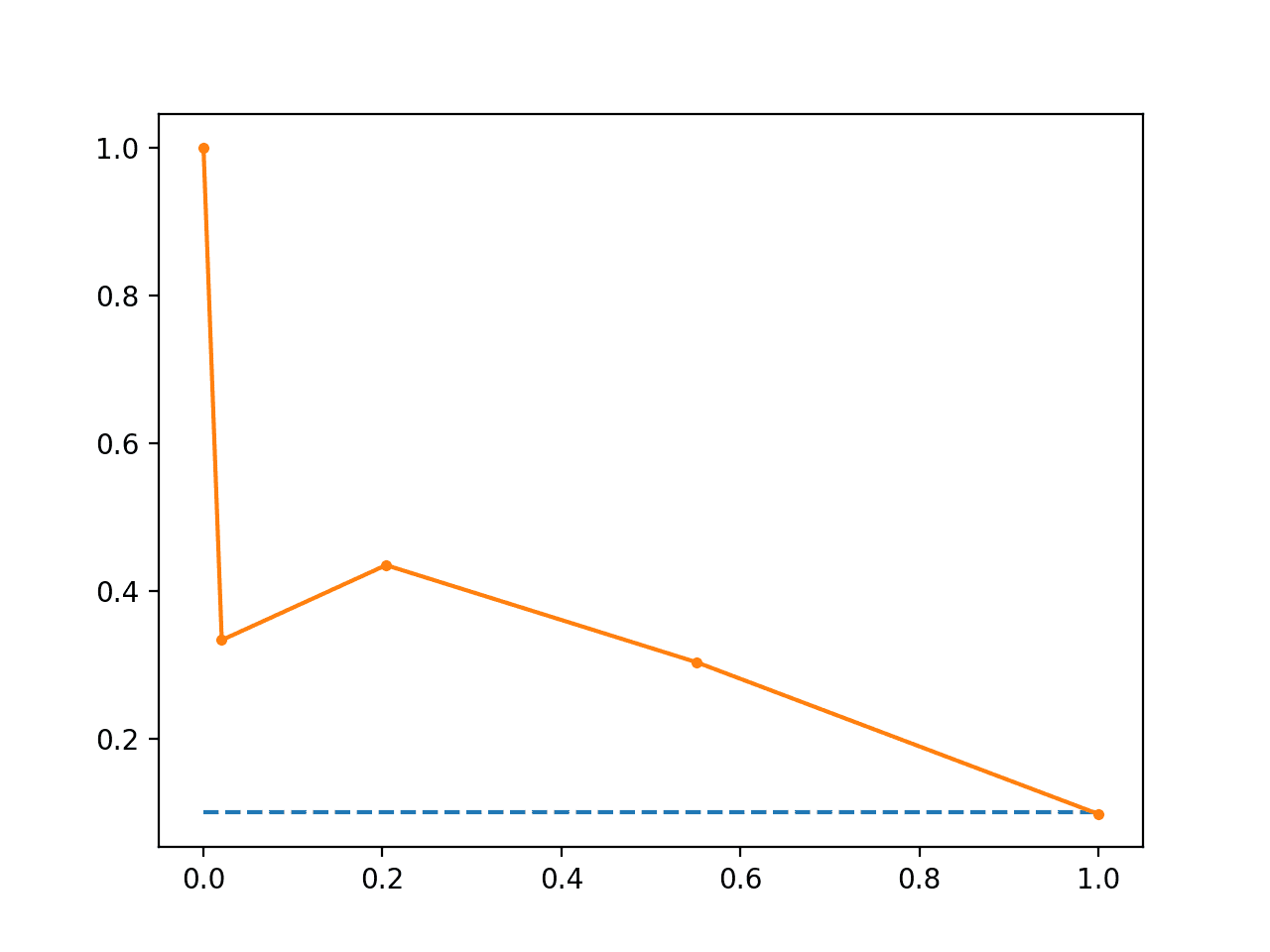
Line Plot of Precision-Recall Curve Imbalanced Dataset
Further Reading
This section provides more resources on the topic if you are looking to go deeper.
Papers
- A critical investigation of recall and precision as measures of retrieval system performance, 1989.
- The Relationship Between Precision-Recall and ROC Curves, 2006.
- The Precision-Recall Plot Is More Informative than the ROC Plot When Evaluating Binary Classifiers on Imbalanced Datasets, 2015.
- ROC Graphs: Notes and Practical Considerations for Data Mining Researchers, 2003.
API
- sklearn.metrics.roc_curve API
- sklearn.metrics.roc_auc_score API
- sklearn.metrics.precision_recall_curve API
- sklearn.metrics.auc API
- sklearn.metrics.average_precision_score API
- Precision-Recall, scikit-learn
- Precision, recall and F-measures, scikit-learn
Articles
- Receiver operating characteristic on Wikipedia
- Sensitivity and specificity on Wikipedia
- Precision and recall on Wikipedia
- Information retrieval on Wikipedia
- F1 score on Wikipedia
- ROC and precision-recall with imbalanced datasets, blog.
Summary
In this tutorial, you discovered ROC Curves, Precision-Recall Curves, and when to use each to interpret the prediction of probabilities for binary classification problems.
Specifically, you learned:
- ROC Curves summarize the trade-off between the true positive rate and false positive rate for a predictive model using different probability thresholds.
- Precision-Recall curves summarize the trade-off between the true positive rate and the positive predictive value for a predictive model using different probability thresholds.
- ROC curves are appropriate when the observations are balanced between each class, whereas precision-recall curves are appropriate for imbalanced datasets.
Do you have any questions?
Ask your questions in the comments below and I will do my best to answer.
The post How and When to Use ROC Curves and Precision-Recall Curves for Classification in Python appeared first on Machine Learning Mastery.