Author: Jason Brownlee
Instead of predicting class values directly for a classification problem, it can be convenient to predict the probability of an observation belonging to each possible class.
Predicting probabilities allows some flexibility including deciding how to interpret the probabilities, presenting predictions with uncertainty, and providing more nuanced ways to evaluate the skill of the model.
Predicted probabilities that match the expected distribution of probabilities for each class are referred to as calibrated. The problem is, not all machine learning models are capable of predicting calibrated probabilities.
There are methods to both diagnose how calibrated predicted probabilities are and to better calibrate the predicted probabilities with the observed distribution of each class. Often, this can lead to better quality predictions, depending on how the skill of the model is evaluated.
In this tutorial, you will discover the importance of calibrating predicted probabilities and how to diagnose and improve the calibration of models used for probabilistic classification.
After completing this tutorial, you will know:
- Nonlinear machine learning algorithms often predict uncalibrated class probabilities.
- Reliability diagrams can be used to diagnose the calibration of a model, and methods can be used to better calibrate predictions for a problem.
- How to develop reliability diagrams and calibrate classification models in Python with scikit-learn.
Let’s get started.

How and When to Use a Calibrated Classification Model with scikit-learn
Photo by Nigel Howe, some rights reserved.
Tutorial Overview
This tutorial is divided into four parts; they are:
- Predicting Probabilities
- Calibration of Predictions
- How to Calibrate Probabilities in Python
- Worked Example of Calibrating SVM Probabilities
Predicting Probabilities
A classification predictive modeling problem requires predicting or forecasting a label for a given observation.
An alternative to predicting the label directly, a model may predict the probability of an observation belonging to each possible class label.
This provides some flexibility both in the way predictions are interpreted and presented (choice of threshold and prediction uncertainty) and in the way the model is evaluated.
Although a model may be able to predict probabilities, the distribution and behavior of the probabilities may not match the expected distribution of observed probabilities in the training data.
This is especially common with complex nonlinear machine learning algorithms that do not directly make probabilistic predictions and instead use approximations.
The distribution of the probabilities can be adjusted to better match the expected distribution observed in the data. This adjustment is referred to as calibration, as in the calibration of the model or the calibration of the distribution of class probabilities.
[…] we desire that the estimated class probabilities are reflective of the true underlying probability of the sample. That is, the predicted class probability (or probability-like value) needs to be well-calibrated. To be well-calibrated, the probabilities must effectively reflect the true likelihood of the event of interest.
— Page 249, Applied Predictive Modeling, 2013.
Calibration of Predictions
There are two concerns in calibrating probabilities; they are diagnosing the calibration of predicted probabilities and the calibration process itself.
Reliability Diagrams (Calibration Curves)
A reliability diagram is a line plot of the relative frequency of what was observed (y-axis) versus the predicted probability frequency (x-axis).
Reliability diagrams are common aids for illustrating the properties of probabilistic forecast systems. They consist of a plot of the observed relative frequency against the predicted probability, providing a quick visual intercomparison when tuning probabilistic forecast systems, as well as documenting the performance of the final product
— Increasing the Reliability of Reliability Diagrams, 2007.
Specifically, the predicted probabilities are divided up into a fixed number of buckets along the x-axis. The number of events (class=1) are then counted for each bin (e.g. the relative observed frequency). Finally, the counts are normalized. The results are then plotted as a line plot.
These plots are commonly referred to as ‘reliability‘ diagrams in forecast literature, although may also be called ‘calibration‘ plots or curves as they summarize how well the forecast probabilities are calibrated.
The better calibrated or more reliable a forecast, the closer the points will appear along the main diagonal from the bottom left to the top right of the plot.
The position of the points or the curve relative to the diagonal can help to interpret the probabilities; for example:
- Below the diagonal: The model has over-forecast; the probabilities are too large.
- Above the diagonal: The model has under-forecast; the probabilities are too small.
Probabilities, by definition, are continuous, so we expect some separation from the line, often shown as an S-shaped curve showing pessimistic tendencies over-forecasting low probabilities and under-forecasting high probabilities.
Reliability diagrams provide a diagnostic to check whether the forecast value Xi is reliable. Roughly speaking, a probability forecast is reliable if the event actually happens with an observed relative frequency consistent with the forecast value.
— Increasing the Reliability of Reliability Diagrams, 2007.
The reliability diagram can help to understand the relative calibration of the forecasts from different predictive models.
Probability Calibration
The predictions made by a predictive model can be calibrated.
Calibrated predictions may (or may not) result in an improved calibration on a reliability diagram.
Some algorithms are fit in such a way that their predicted probabilities are already calibrated. Without going into details why, logistic regression is one such example.
Other algorithms do not directly produce predictions of probabilities, and instead a prediction of probabilities must be approximated. Some examples include neural networks, support vector machines, and decision trees.
The predicted probabilities from these methods will likely be uncalibrated and may benefit from being modified via calibration.
Calibration of prediction probabilities is a rescaling operation that is applied after the predictions have been made by a predictive model.
There are two popular approaches to calibrating probabilities; they are the Platt Scaling and Isotonic Regression.
Platt Scaling is simpler and is suitable for reliability diagrams with the S-shape. Isotonic Regression is more complex, requires a lot more data (otherwise it may overfit), but can support reliability diagrams with different shapes (is nonparametric).
Platt Scaling is most effective when the distortion in the predicted probabilities is sigmoid-shaped. Isotonic Regression is a more powerful calibration method that can correct any monotonic distortion. Unfortunately, this extra power comes at a price. A learning curve analysis shows that Isotonic Regression is more prone to overfitting, and thus performs worse than Platt Scaling, when data is scarce.
— Predicting Good Probabilities With Supervised Learning, 2005.
Note, and this is really important: better calibrated probabilities may or may not lead to better class-based or probability-based predictions. It really depends on the specific metric used to evaluate predictions.
In fact, some empirical results suggest that the algorithms that can benefit the more from calibrating predicted probabilities include SVMs, bagged decision trees, and random forests.
[…] after calibration the best methods are boosted trees, random forests and SVMs.
— Predicting Good Probabilities With Supervised Learning, 2005.
How to Calibrate Probabilities in Python
The scikit-learn machine learning library allows you to both diagnose the probability calibration of a classifier and calibrate a classifier that can predict probabilities.
Diagnose Calibration
You can diagnose the calibration of a classifier by creating a reliability diagram of the actual probabilities versus the predicted probabilities on a test set.
In scikit-learn, this is called a calibration curve.
This can be implemented by first calculating the calibration_curve() function. This function takes the true class values for a dataset and the predicted probabilities for the main class (class=1). The function returns the true probabilities for each bin and the predicted probabilities for each bin. The number of bins can be specified via the n_bins argument and default to 5.
For example, below is a code snippet showing the API usage:
...
# predict probabilities
probs = model.predic_proba(testX)[:,1]
# reliability diagram
fop, mpv = calibration_curve(testy, probs, n_bins=10)
# plot perfectly calibrated
pyplot.plot([0, 1], [0, 1], linestyle='--')
# plot model reliability
pyplot.plot(mpv, fop, marker='.')
pyplot.show()
Calibrate Classifier
A classifier can be calibrated in scikit-learn using the CalibratedClassifierCV class.
There are two ways to use this class: prefit and cross-validation.
You can fit a model on a training dataset and calibrate this prefit model using a hold out validation dataset.
For example, below is a code snippet showing the API usage:
...
# prepare data
trainX, trainy = ...
valX, valy = ...
testX, testy = ...
# fit base model on training dataset
model = ...
model.fit(trainX, trainy)
# calibrate model on validation data
calibrator = CalibratedClassifierCV(model, cv='prefit')
calibrator.fit(valX, valy)
# evaluate the model
yhat = calibrator.predict(testX)
Alternately, the CalibratedClassifierCV can fit multiple copies of the model using k-fold cross-validation and calibrate the probabilities predicted by these models using the hold out set. Predictions are made using each of the trained models.
For example, below is a code snippet showing the API usage:
...
# prepare data
trainX, trainy = ...
testX, testy = ...
# define base model
model = ...
# fit and calibrate model on training data
calibrator = CalibratedClassifierCV(model, cv=3)
calibrator.fit(trainX, trainy)
# evaluate the model
yhat = calibrator.predict(testX)
The CalibratedClassifierCV class supports two types of probability calibration; specifically, the parametric ‘sigmoid‘ method (Platt’s method) and the nonparametric ‘isotonic‘ method which can be specified via the ‘method‘ argument.
Worked Example of Calibrating SVM Probabilities
We can make the discussion of calibration concrete with some worked examples.
In these examples, we will fit a support vector machine (SVM) to a noisy binary classification problem and use the model to predict probabilities, then review the calibration using a reliability diagram and calibrate the classifier and review the result.
SVM is a good candidate model to calibrate because it does not natively predict probabilities, meaning the probabilities are often uncalibrated.
A note on SVM: probabilities can be predicted by calling the decision_function() function on the fit model instead of the usual predict_proba() function. The probabilities are not normalized, but can be normalized when calling the calibration_curve() function by setting the ‘normalize‘ argument to ‘True‘.
The example below fits an SVM model on the test problem, predicted probabilities, and plots the calibration of the probabilities as a reliability diagram,
# SVM reliability diagram
from sklearn.datasets import make_classification
from sklearn.svm import SVC
from sklearn.model_selection import train_test_split
from sklearn.calibration import calibration_curve
from matplotlib import pyplot
# generate 2 class dataset
X, y = make_classification(n_samples=1000, n_classes=2, weights=[1,1], random_state=1)
# split into train/test sets
trainX, testX, trainy, testy = train_test_split(X, y, test_size=0.5, random_state=2)
# fit a model
model = SVC()
model.fit(trainX, trainy)
# predict probabilities
probs = model.decision_function(testX)
# reliability diagram
fop, mpv = calibration_curve(testy, probs, n_bins=10, normalize=True)
# plot perfectly calibrated
pyplot.plot([0, 1], [0, 1], linestyle='--')
# plot model reliability
pyplot.plot(mpv, fop, marker='.')
pyplot.show()
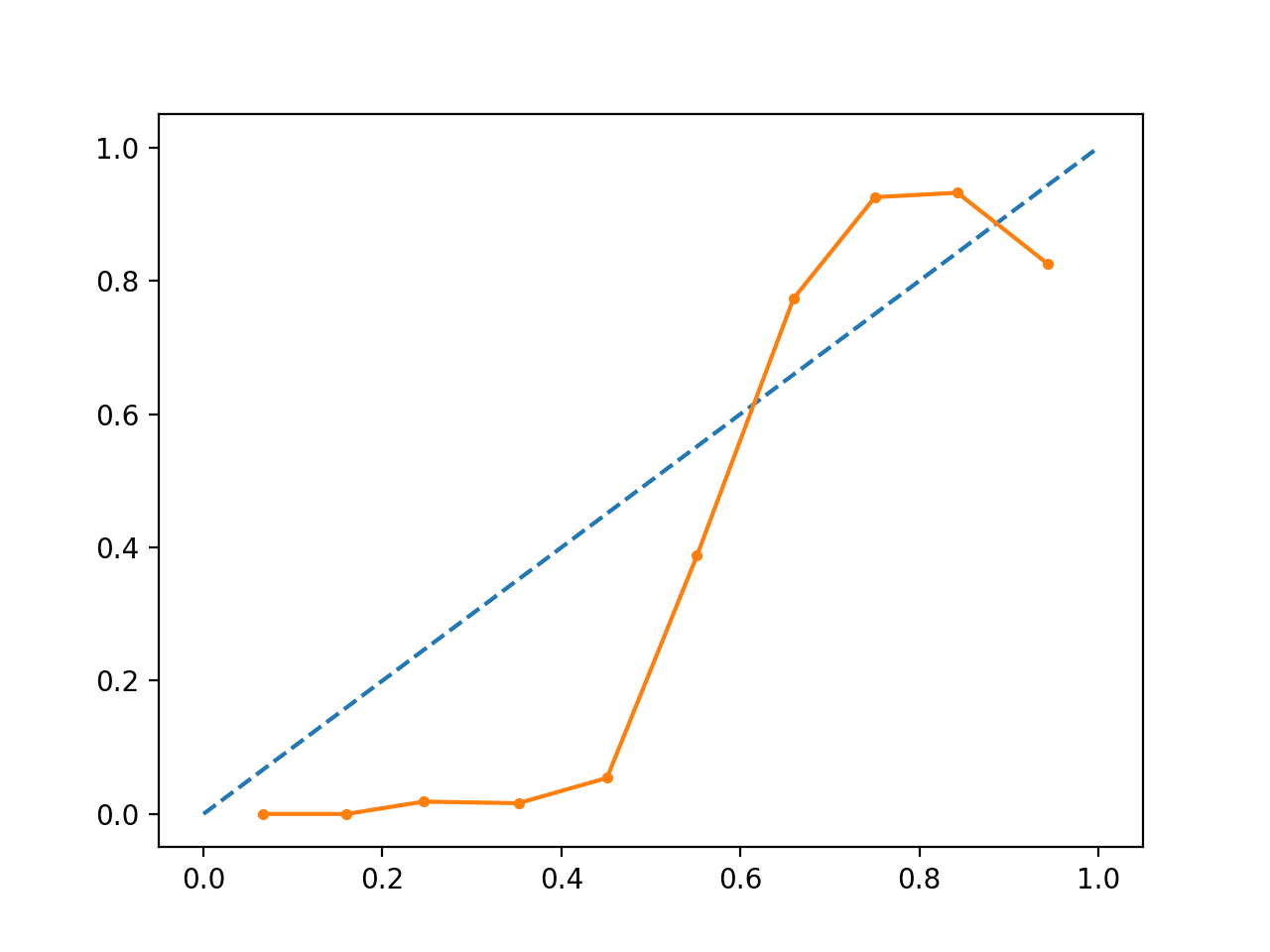
Running the example creates a reliability diagram showing the calibration of the SVMs predicted probabilities (solid line) compared to a perfectly calibrated model along the diagonal of the plot (dashed line.)
We can see the expected S-shaped curve of a conservative forecast.

Uncalibrated SVM Reliability Diagram
We can update the example to fit the SVM via the CalibratedClassifierCV class using 5-fold cross-validation, using the holdout sets to calibrate the predicted probabilities.
The complete example is listed below.
# SVM reliability diagram with calibration
from sklearn.datasets import make_classification
from sklearn.svm import SVC
from sklearn.calibration import CalibratedClassifierCV
from sklearn.model_selection import train_test_split
from sklearn.calibration import calibration_curve
from matplotlib import pyplot
# generate 2 class dataset
X, y = make_classification(n_samples=1000, n_classes=2, weights=[1,1], random_state=1)
# split into train/test sets
trainX, testX, trainy, testy = train_test_split(X, y, test_size=0.5, random_state=2)
# fit a model
model = SVC()
calibrated = CalibratedClassifierCV(model, method='sigmoid', cv=5)
calibrated.fit(trainX, trainy)
# predict probabilities
probs = calibrated.predict_proba(testX)[:, 1]
# reliability diagram
fop, mpv = calibration_curve(testy, probs, n_bins=10, normalize=True)
# plot perfectly calibrated
pyplot.plot([0, 1], [0, 1], linestyle='--')
# plot calibrated reliability
pyplot.plot(mpv, fop, marker='.')
pyplot.show()
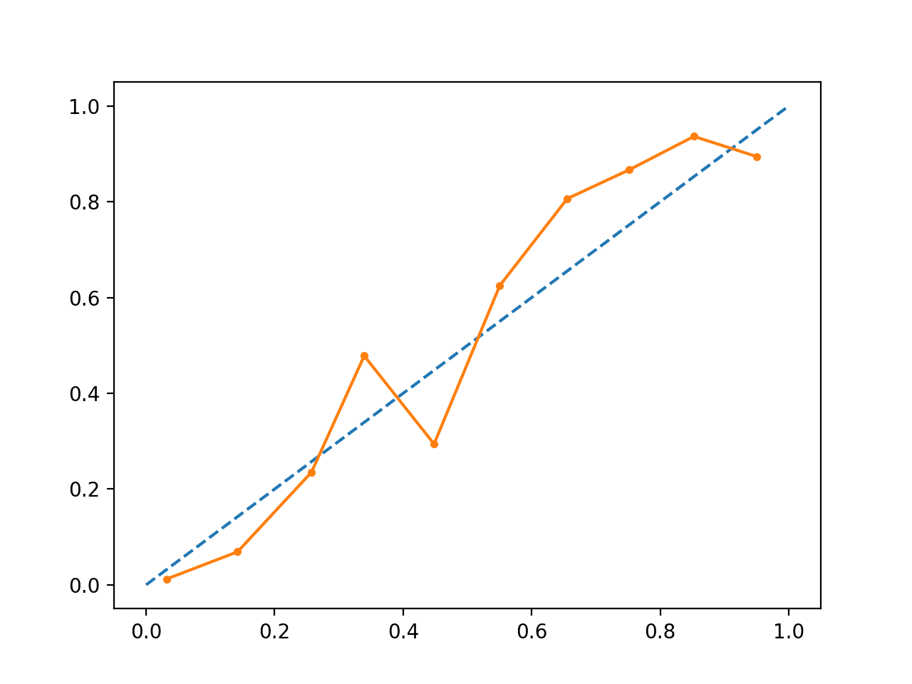
Running the example creates a reliability diagram for the calibrated probabilities.
The shape of the calibrated probabilities is different, hugging the diagonal line much better, although still under-forecasting in the upper quadrant.
Visually, the plot suggests a better calibrated model.

Calibrated SVM Reliability Diagram
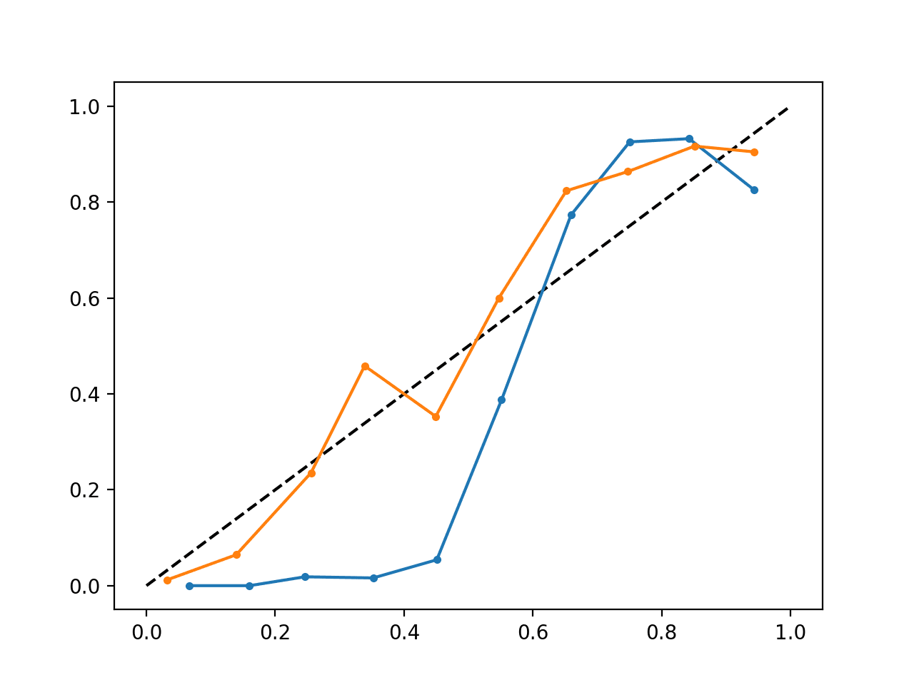
We can make the contrast between the two models more obvious by including both reliability diagrams on the same plot.
The complete example is listed below.
# SVM reliability diagrams with uncalibrated and calibrated probabilities
from sklearn.datasets import make_classification
from sklearn.svm import SVC
from sklearn.calibration import CalibratedClassifierCV
from sklearn.model_selection import train_test_split
from sklearn.calibration import calibration_curve
from matplotlib import pyplot

# predict uncalibrated probabilities
def uncalibrated(trainX, testX, trainy):
	# fit a model
	model = SVC()
	model.fit(trainX, trainy)
	# predict probabilities
	return model.decision_function(testX)

# predict calibrated probabilities
def calibrated(trainX, testX, trainy):
	# define model
	model = SVC()
	# define and fit calibration model
	calibrated = CalibratedClassifierCV(model, method='sigmoid', cv=5)
	calibrated.fit(trainX, trainy)
	# predict probabilities
	return calibrated.predict_proba(testX)[:, 1]

# generate 2 class dataset
X, y = make_classification(n_samples=1000, n_classes=2, weights=[1,1], random_state=1)
# split into train/test sets
trainX, testX, trainy, testy = train_test_split(X, y, test_size=0.5, random_state=2)
# uncalibrated predictions
yhat_uncalibrated = uncalibrated(trainX, testX, trainy)
# calibrated predictions
yhat_calibrated = calibrated(trainX, testX, trainy)
# reliability diagrams
fop_uncalibrated, mpv_uncalibrated = calibration_curve(testy, yhat_uncalibrated, n_bins=10, normalize=True)
fop_calibrated, mpv_calibrated = calibration_curve(testy, yhat_calibrated, n_bins=10)
# plot perfectly calibrated
pyplot.plot([0, 1], [0, 1], linestyle='--', color='black')
# plot model reliabilities
pyplot.plot(mpv_uncalibrated, fop_uncalibrated, marker='.')
pyplot.plot(mpv_calibrated, fop_calibrated, marker='.')
pyplot.show()
Running the example creates a single reliability diagram showing both the calibrated (orange) and uncalibrated (blue) probabilities.
It is not really an apples-to-apples comparison as the predictions made by the calibrated model are in fact a combination of five submodels.
Nevertheless, we do see a marked difference in the reliability of the calibrated probabilities (very likely caused by the calibration process).

Calibrated and Uncalibrated SVM Reliability Diagram
Further Reading
This section provides more resources on the topic if you are looking to go deeper.
Books and Papers
- Applied Predictive Modeling, 2013.
- Predicting Good Probabilities With Supervised Learning, 2005.
- Obtaining calibrated probability estimates from decision trees and naive Bayesian classifiers, 2001.
- Increasing the Reliability of Reliability Diagrams, 2007.
API
- sklearn.calibration.CalibratedClassifierCV API
- sklearn.calibration.calibration_curve API
- Probability calibration, scikit-learn User Guide
- Probability Calibration curves, scikit-learn
- Comparison of Calibration of Classifiers, scikit-learn
Articles
- CAWCAR Verification Website
- Calibration (statistics) on Wikipedia
- Probabilistic classification on Wikipedia
- Scikit correct way to calibrate classifiers with CalibratedClassifierCV on CrossValidated
Summary
In this tutorial, you discovered the importance of calibrating predicted probabilities and how to diagnose and improve the calibration of models used for probabilistic classification.
Specifically, you learned:
- Nonlinear machine learning algorithms often predict uncalibrated class probabilities.
- Reliability diagrams can be used to diagnose the calibration of a model, and methods can be used to better calibrate predictions for a problem.
- How to develop reliability diagrams and calibrate classification models in Python with scikit-learn.
Do you have any questions?
Ask your questions in the comments below and I will do my best to answer.
The post How and When to Use a Calibrated Classification Model with scikit-learn appeared first on Machine Learning Mastery.
