
Author: Jason Brownlee
How to Score Probability Predictions in Python and
Develop an Intuition for Different Metrics.
Predicting probabilities instead of class labels for a classification problem can provide additional nuance and uncertainty for the predictions.
The added nuance allows more sophisticated metrics to be used to interpret and evaluate the predicted probabilities. In general, methods for the evaluation of the accuracy of predicted probabilities are referred to as scoring rules or scoring functions.
In this tutorial, you will discover three scoring methods that you can use to evaluate the predicted probabilities on your classification predictive modeling problem.
After completing this tutorial, you will know:
- The log loss score that heavily penalizes predicted probabilities far away from their expected value.
- The Brier score that is gentler than log loss but still penalizes proportional to the distance from the expected value.
- The area under ROC curve that summarizes the likelihood of the model predicting a higher probability for true positive cases than true negative cases.
Let’s get started.

A Gentle Introduction to Probability Scoring Methods in Python
Photo by Paul Balfe, some rights reserved.
Tutorial Overview
This tutorial is divided into four parts; they are:
- Log Loss Score
- Brier Score
- ROC AUC Score
- Tuning Predicted Probabilities
Log Loss Score
Log loss, also called “logistic loss,” “logarithmic loss,” or “cross entropy” can be used as a measure for evaluating predicted probabilities.
Each predicted probability is compared to the actual class output value (0 or 1) and a score is calculated that penalizes the probability based on the distance from the expected value. The penalty is logarithmic, offering a small score for small differences (0.1 or 0.2) and enormous score for a large difference (0.9 or 1.0).
A model with perfect skill has a log loss score of 0.0.
In order to summarize the skill of a model using log loss, the log loss is calculated for each predicted probability, and the average loss is reported.
The log loss can be implemented in Python using the log_loss() function in scikit-learn.
For example:
from sklearn.metrics import log_loss
...
model = ...
testX, testy = ...
# predict probabilities
probs = model.predict_proba(testX)
# keep the predictions for class 1 only
probs = probs[:, 1]
# calculate log loss
loss = log_loss(testy, probs)
In the binary classification case, the function takes a list of true outcome values and a list of probabilities as arguments and calculates the average log loss for the predictions.
We can make a single log loss score concrete with an example.
Given a specific known outcome of 0, we can predict values of 0.0 to 1.0 in 0.01 increments (101 predictions) and calculate the log loss for each. The result is a curve showing how much each prediction is penalized as the probability gets further away from the expected value. We can repeat this for a known outcome of 1 and see the same curve in reverse.
The complete example is listed below.
# plot impact of logloss for single forecasts
from sklearn.metrics import log_loss
from matplotlib import pyplot
from numpy import array
# predictions as 0 to 1 in 0.01 increments
yhat = [x*0.01 for x in range(0, 101)]
# evaluate predictions for a 0 true value
losses_0 = [log_loss([0], [x], labels=[0,1]) for x in yhat]
# evaluate predictions for a 1 true value
losses_1 = [log_loss([1], [x], labels=[0,1]) for x in yhat]
# plot input to loss
pyplot.plot(yhat, losses_0, label='true=0')
pyplot.plot(yhat, losses_1, label='true=1')
pyplot.legend()
pyplot.show()
Running the example creates a line plot showing the loss scores for probability predictions from 0.0 to 1.0 for both the case where the true label is 0 and 1.
This helps to build an intuition for the effect that the loss score has when evaluating predictions.
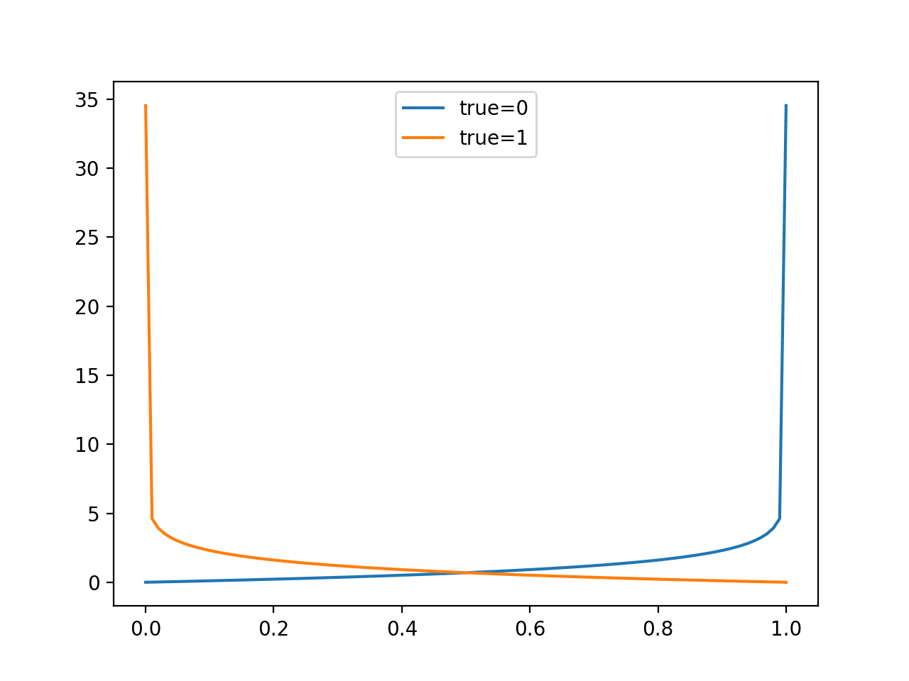
Line Plot of Evaluating Predictions with Log Loss
Model skill is reported as the average log loss across the predictions in a test dataset.
As an average, we can expect that the score will be suitable with a balanced dataset and misleading when there is a large imbalance between the two classes in the test set. This is because predicting 0 or small probabilities will result in a small loss.
We can demonstrate this by comparing the distribution of loss values when predicting different constant probabilities for a balanced and an imbalanced dataset.
First, the example below predicts values from 0.0 to 1.0 in 0.1 increments for a balanced dataset of 50 examples of class 0 and 1.
# plot impact of logloss with balanced datasets
from sklearn.metrics import log_loss
from matplotlib import pyplot
from numpy import array
# define an imbalanced dataset
testy = [0 for x in range(50)] + [1 for x in range(50)]
# loss for predicting different fixed probability values
predictions = [0.0, 0.1, 0.2, 0.3, 0.4, 0.5, 0.6, 0.7, 0.8, 0.9, 1.0]
losses = [log_loss(testy, [y for x in range(len(testy))]) for y in predictions]
# plot predictions vs loss
pyplot.plot(predictions, losses)
pyplot.show()
Running the example, we can see that a model is better-off predicting probabilities values that are not sharp (close to the edge) and are back towards the middle of the distribution.
The penalty of being wrong with a sharp probability is very large.
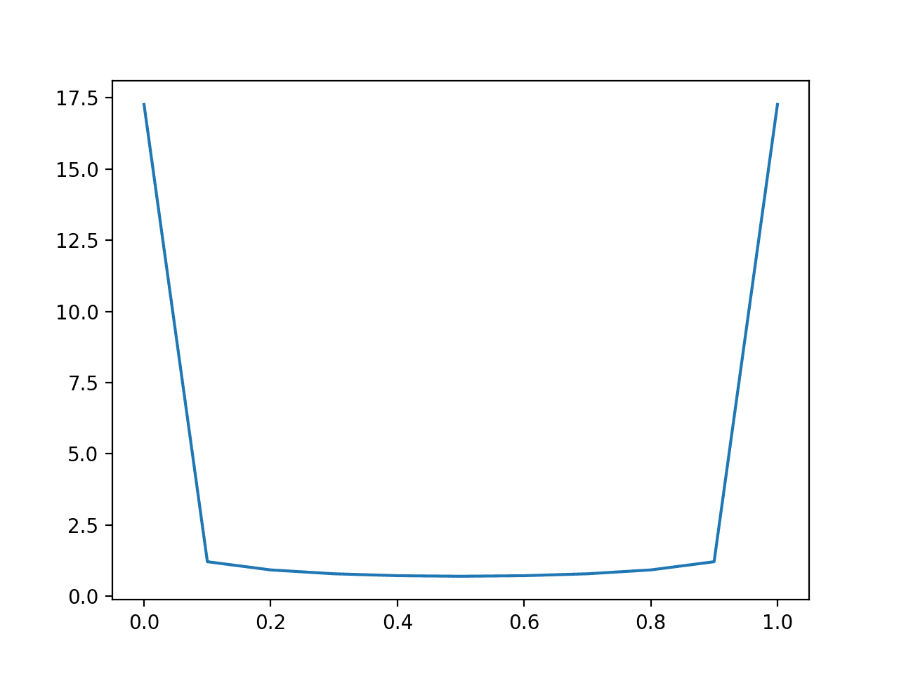
Line Plot of Predicting Log Loss for Balanced Dataset
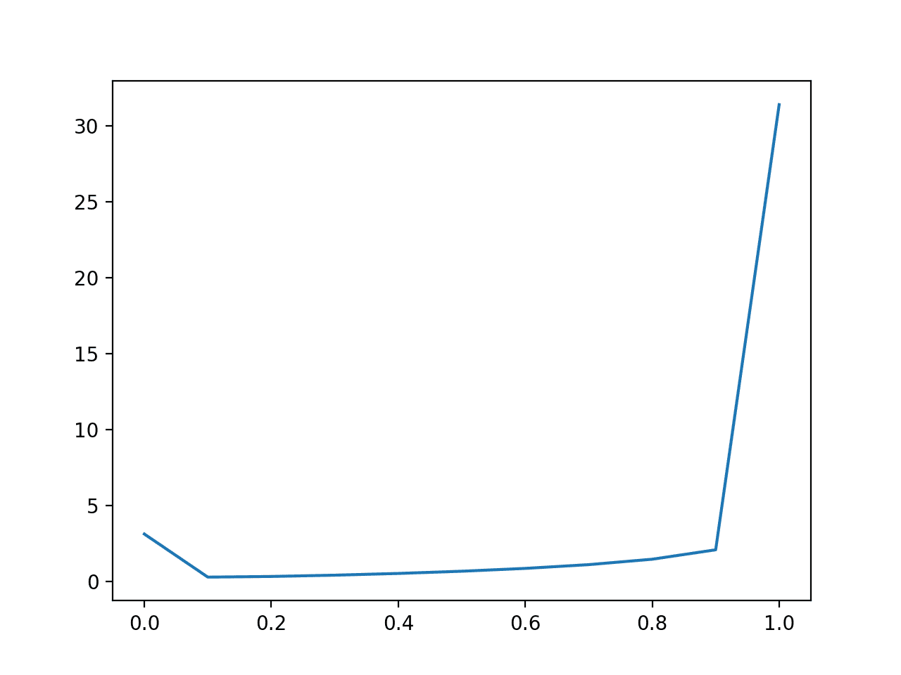
We can repeat this experiment with an imbalanced dataset with a 10:1 ratio of class 0 to class 1.
# plot impact of logloss with imbalanced datasets
from sklearn.metrics import log_loss
from matplotlib import pyplot
from numpy import array
# define an imbalanced dataset
testy = [0 for x in range(100)] + [1 for x in range(10)]
# loss for predicting different fixed probability values
predictions = [0.0, 0.1, 0.2, 0.3, 0.4, 0.5, 0.6, 0.7, 0.8, 0.9, 1.0]
losses = [log_loss(testy, [y for x in range(len(testy))]) for y in predictions]
# plot predictions vs loss
pyplot.plot(predictions, losses)
pyplot.show()
Here, we can see that a model that is skewed towards predicting very small probabilities will perform well, optimistically so.
The naive model that predicts a constant probability of 0.1 will be the baseline model to beat.
The result suggests that model skill evaluated with log loss should be interpreted carefully in the case of an imbalanced dataset, perhaps adjusted relative to the base rate for class 1 in the dataset.
Line Plot of Predicting Log Loss for Imbalanced Dataset
Brier Score
The Brier score, named for Glenn Brier, calculates the mean squared error between predicted probabilities and the expected values.
The score summarizes the magnitude of the error in the probability forecasts.
The error score is always between 0.0 and 1.0, where a model with perfect skill has a score of 0.0.
Predictions that are further away from the expected probability are penalized, but less severely as in the case of log loss.
The skill of a model can be summarized as the average Brier score across all probabilities predicted for a test dataset.
The Brier score can be calculated in Python using the brier_score_loss() function in scikit-learn. It takes the true class values (0, 1) and the predicted probabilities for all examples in a test dataset as arguments and returns the average Brier score.
For example:
from sklearn.metrics import brier_score_loss
...
model = ...
testX, testy = ...
# predict probabilities
probs = model.predict_proba(testX)
# keep the predictions for class 1 only
probs = probs[:, 1]
# calculate bier score
loss = brier_score_loss(testy, probs)
We can evaluate the impact of prediction errors by comparing the Brier score for single probability forecasts in increasing error from 0.0 to 1.0.
The complete example is listed below.
# plot impact of brier for single forecasts
from sklearn.metrics import brier_score_loss
from matplotlib import pyplot
from numpy import array
# predictions as 0 to 1 in 0.01 increments
yhat = [x*0.01 for x in range(0, 101)]
# evaluate predictions for a 1 true value
losses = [brier_score_loss([1], [x], pos_label=[1]) for x in yhat]
# plot input to loss
pyplot.plot(yhat, losses)
pyplot.show()
Running the example creates a plot of the probability prediction error in absolute terms (x-axis) to the calculated Brier score (y axis).
We can see a familiar quadratic curve, increasing from 0 to 1 with the squared error.
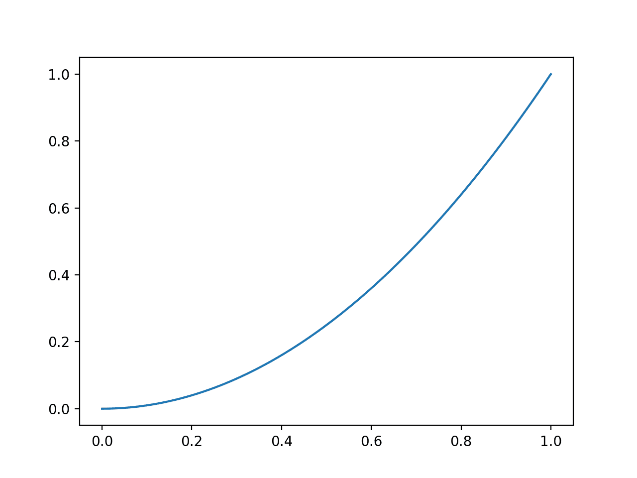
Line Plot of Evaluating Predictions with Brier Score
Model skill is reported as the average Brier across the predictions in a test dataset.
As with log loss, we can expect that the score will be suitable with a balanced dataset and misleading when there is a large imbalance between the two classes in the test set.
We can demonstrate this by comparing the distribution of loss values when predicting different constant probabilities for a balanced and an imbalanced dataset.
First, the example below predicts values from 0.0 to 1.0 in 0.1 increments for a balanced dataset of 50 examples of class 0 and 1.
# plot impact of brier score with balanced datasets
from sklearn.metrics import brier_score_loss
from matplotlib import pyplot
from numpy import array
# define an imbalanced dataset
testy = [0 for x in range(50)] + [1 for x in range(50)]
# brier score for predicting different fixed probability values
predictions = [0.0, 0.1, 0.2, 0.3, 0.4, 0.5, 0.6, 0.7, 0.8, 0.9, 1.0]
losses = [brier_score_loss(testy, [y for x in range(len(testy))]) for y in predictions]
# plot predictions vs loss
pyplot.plot(predictions, losses)
pyplot.show()
Running the example, we can see that a model is better-off predicting middle of the road probabilities values like 0.5.
Unlike log loss that is quite flat for close probabilities, the parabolic shape shows the clear quadratic increase in the score penalty as the error is increased.
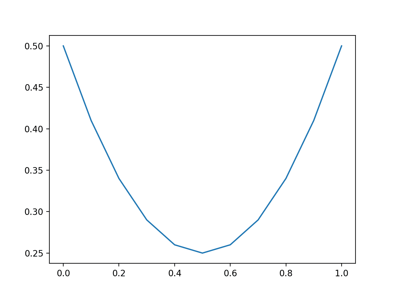
Line Plot of Predicting Brier Score for Balanced Dataset
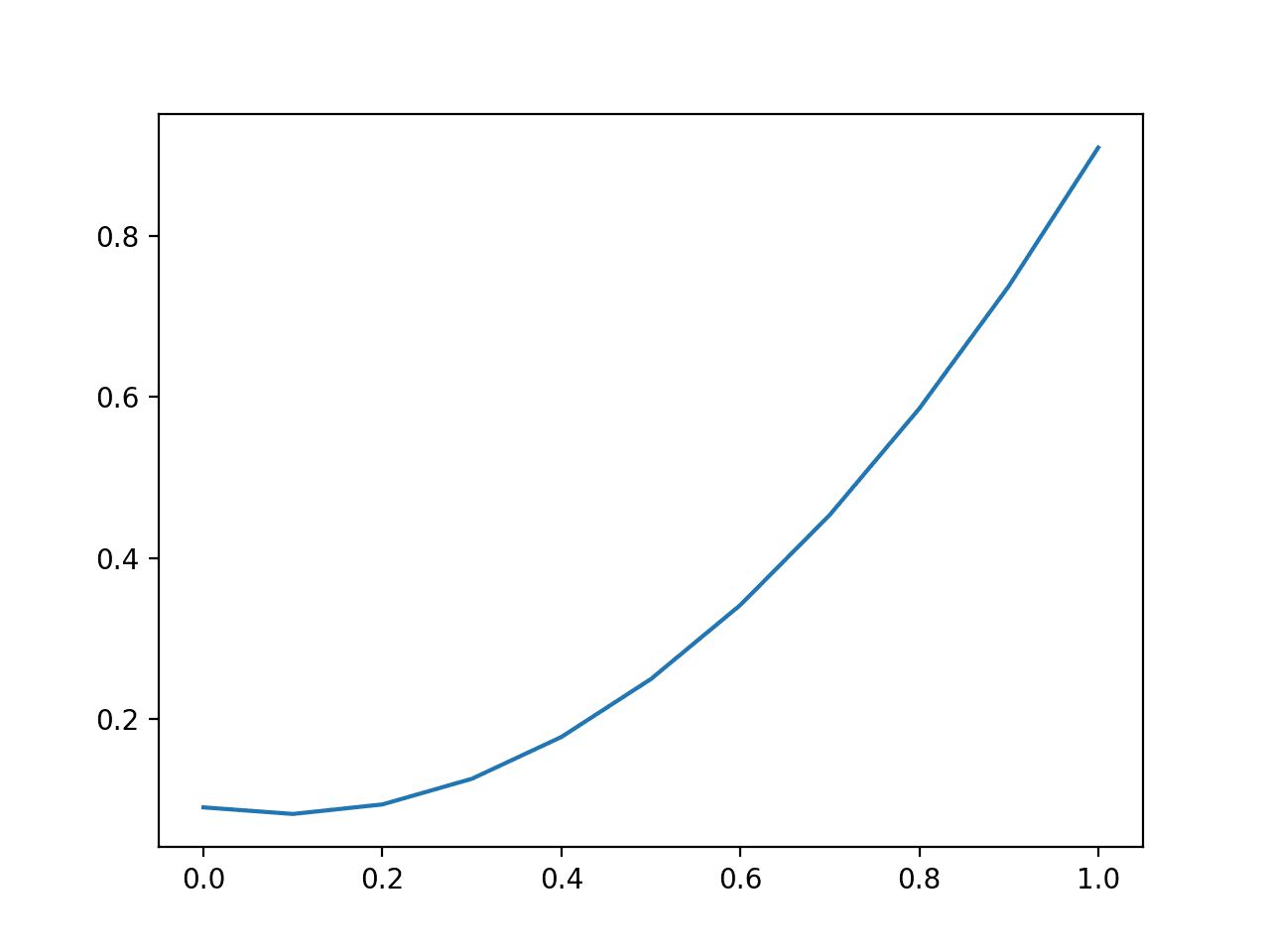
We can repeat this experiment with an imbalanced dataset with a 10:1 ratio of class 0 to class 1.
# plot impact of brier score with imbalanced datasets
from sklearn.metrics import brier_score_loss
from matplotlib import pyplot
from numpy import array
# define an imbalanced dataset
testy = [0 for x in range(100)] + [1 for x in range(10)]
# brier score for predicting different fixed probability values
predictions = [0.0, 0.1, 0.2, 0.3, 0.4, 0.5, 0.6, 0.7, 0.8, 0.9, 1.0]
losses = [brier_score_loss(testy, [y for x in range(len(testy))]) for y in predictions]
# plot predictions vs loss
pyplot.plot(predictions, losses)
pyplot.show()
Running the example, we see a very different picture for the imbalanced dataset.
Like the average log loss, the average Brier score will present optimistic scores on an imbalanced dataset, rewarding small prediction values that reduce error on the majority class.
In these cases, Brier score should be compared relative to the naive prediction (e.g. the base rate of the minority class or 0.1 in the above example) or normalized by the naive score.
This latter example is common and is called the Brier Skill Score (BSS).
BSS = 1 - (BS / BS_ref)
Where BS is the Brier skill of model, and BS_ref is the Brier skill of the naive prediction.
The Brier Skill Score reports the relative skill of the probability prediction over the naive forecast.
A good update to the scikit-learn API would be to add a parameter to the brier_score_loss() to support the calculation of the Brier Skill Score.
Line Plot of Predicting Log Loss for Imbalanced Dataset
ROC AUC Score
A predicted probability for a binary (two-class) classification problem can be interpreted with a threshold.
The threshold defines the point at which the probability is mapped to class 0 versus class 1, where the default threshold is 0.5. Alternate threshold values allow the model to be tuned for higher or lower false positives and false negatives.
Tuning the threshold by the operator is particularly important on problems where one type of error is more or less important than another or when a model is makes disproportionately more or less of a specific type of error.
The Receiver Operating Characteristic, or ROC, curve is a plot of the true positive rate versus the false positive rate for the predictions of a model for multiple thresholds between 0.0 and 1.0.
Predictions that have no skill for a given threshold are drawn on the diagonal of the plot from the bottom left to the top right. This line represents no-skill predictions for each threshold.
Models that have skill have a curve above this diagonal line that bows towards the top left corner.
Below is an example of fitting a logistic regression model on a binary classification problem and calculating and plotting the ROC curve for the predicted probabilities on a test set of 500 new data instances.
# roc curve
from sklearn.datasets import make_classification
from sklearn.linear_model import LogisticRegression
from sklearn.model_selection import train_test_split
from sklearn.metrics import roc_curve
from matplotlib import pyplot
# generate 2 class dataset
X, y = make_classification(n_samples=1000, n_classes=2, random_state=1)
# split into train/test sets
trainX, testX, trainy, testy = train_test_split(X, y, test_size=0.5, random_state=2)
# fit a model
model = LogisticRegression()
model.fit(trainX, trainy)
# predict probabilities
probs = model.predict_proba(testX)
# keep probabilities for the positive outcome only
probs = probs[:, 1]
# calculate roc curve
fpr, tpr, thresholds = roc_curve(testy, probs)
# plot no skill
pyplot.plot([0, 1], [0, 1], linestyle='--')
# plot the roc curve for the model
pyplot.plot(fpr, tpr)
# show the plot
pyplot.show()
Running the example creates an example of a ROC curve that can be compared to the no skill line on the main diagonal.
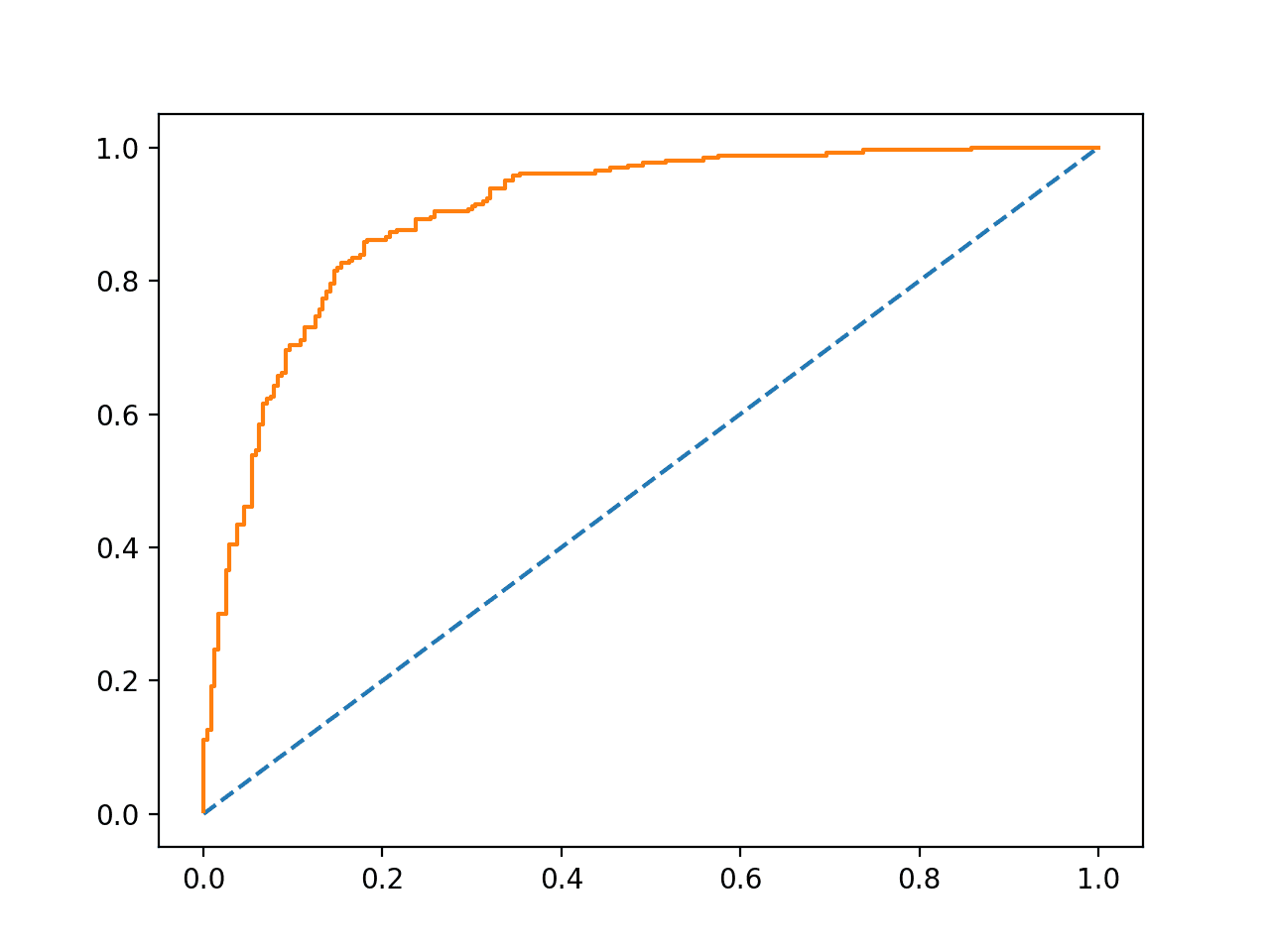
Example ROC Curve
The integrated area under the ROC curve, called AUC or ROC AUC, provides a measure of the skill of the model across all evaluated thresholds.
An AUC score of 0.0 suggests no skill, e.g. a curve along the diagonal, whereas an AUC of 1.0 suggests perfect skill, all points along the left y-axis and top x-axis toward the top left corner.
Predictions by models that have a larger area have better skill across the thresholds, although the specific shape of the curves between models will vary, potentially offering opportunity to optimize models by a pre-chosen threshold. Typically, the threshold is chosen by the operator after the model has been prepared.
The AUC can be calculated in Python using the roc_auc_score() function in scikit-learn.
This function takes a list of true output values and predicted probabilities as arguments and returns the ROC AUC.
For example:
from sklearn.metrics import roc_auc_score
...
model = ...
testX, testy = ...
# predict probabilities
probs = model.predict_proba(testX)
# keep the predictions for class 1 only
probs = probs[:, 1]
# calculate log loss
loss = roc_auc_score(testy, probs)
An AUC score is a measure of the likelihood that the model that produced the predictions will rank a randomly chosen positive example above a randomly chosen negative example. Specifically, that the probability will be higher for a real event (class=1) than a real non-event (class=0).
This is an instructive definition that offers two important intuitions:
- Naive Prediction. A naive prediction under ROC AUC is any constant probability. If the same probability is predicted for every example, there is no discrimination between positive and negative cases, therefore the model has no skill (AUC=0.5).
- Insensitivity to Class Imbalance. ROC AUC is a summary on the models ability to correctly discriminate a single example across different thresholds. As such, it is unconcerned with the base likelihood of each class.
Below, the example demonstrating the ROC curve is updated to calculate and display the AUC.
# roc auc
from sklearn.datasets import make_classification
from sklearn.linear_model import LogisticRegression
from sklearn.model_selection import train_test_split
from sklearn.metrics import roc_auc_score
from matplotlib import pyplot
# generate 2 class dataset
X, y = make_classification(n_samples=1000, n_classes=2, random_state=1)
# split into train/test sets
trainX, testX, trainy, testy = train_test_split(X, y, test_size=0.5, random_state=2)
# fit a model
model = LogisticRegression()
model.fit(trainX, trainy)
# predict probabilities
probs = model.predict_proba(testX)
# keep probabilities for the positive outcome only
probs = probs[:, 1]
# calculate roc auc
auc = roc_auc_score(testy, probs)
print(auc)
Running the example calculates and prints the ROC AUC for the logistic regression model evaluated on 500 new examples.
0.9028044871794871
An important consideration in choosing the ROC AUC is that it does not summarize the specific discriminative power of the model, rather the general discriminative power across all thresholds.
It might be a better tool for model selection rather than in quantifying the practical skill of a model’s predicted probabilities.
Tuning Predicted Probabilities
Predicted probabilities can be tuned to improve or even game a performance measure.
For example, the log loss and Brier scores quantify the average amount of error in the probabilities. As such, predicted probabilities can be tuned to improve these scores in a few ways:
- Making the probabilities less sharp (less confident). This means adjusting the predicted probabilities away from the hard 0 and 1 bounds to limit the impact of penalties of being completely wrong.
- Shift the distribution to the naive prediction (base rate). This means shifting the mean of the predicted probabilities to the probability of the base rate, such as 0.5 for a balanced prediction problem.
Generally, it may be useful to review the calibration of the probabilities using tools like a reliability diagram. This can be achieved using the calibration_curve() function in scikit-learn.
Some algorithms, such as SVM and neural networks, may not predict calibrated probabilities natively. In these cases, the probabilities can be calibrated and in turn may improve the chosen metric. Classifiers can be calibrated in scikit-learn using the CalibratedClassifierCV class.
Further Reading
This section provides more resources on the topic if you are looking to go deeper.
API
- sklearn.metrics.log_loss API
- sklearn.metrics.brier_score_loss API
- sklearn.metrics.roc_curve API
- sklearn.metrics.roc_auc_score API
- sklearn.calibration.calibration_curve API
- sklearn.calibration.CalibratedClassifierCV API
Articles
- Scoring rule, Wikipedia
- Cross entropy, Wikipedia
- Log Loss, fast.ai
- Brier score, Wikipedia
- Receiver operating characteristic, Wikipedia
Summary
In this tutorial, you discovered three metrics that you can use to evaluate the predicted probabilities on your classification predictive modeling problem.
Specifically, you learned:
- The log loss score that heavily penalizes predicted probabilities far away from their expected value.
- The Brier score that is gentler than log loss but still penalizes proportional to the distance from the expected value
- The area under ROC curve that summarizes the likelihood of the model predicting a higher probability for true positive cases than true negative cases.
Do you have any questions?
Ask your questions in the comments below and I will do my best to answer.
The post A Gentle Introduction to Probability Scoring Methods in Python appeared first on Machine Learning Mastery.