Author: Jorge Castanon
Ancient ruins are sometimes discovered after long years investigating regions of the world covered by dense jungle or giant forests. The feeling of an archaeologist at that moment of discovery gives a window into the feeling data scientists often have when getting a view of their data — through visualizations — that clarifies a key aspect of the analysis.
Ancient ruins are sometimes discovered after long years investigating regions of the world covered by dense jungle or giant forests. The feeling of an archaeologist at that moment of discovery gives a window into the feeling data scientists often have when getting a view of their data — through visualizations — that clarifies a key aspect of the analysis.
For both, it’s a Eureka moment!
Data visualization plays two key roles:
1. Communicating results clearly to a general audience.
2. Organizing a view of data that suggests a new hypothesis or a next step in a project.
It’s no surprise that most people prefer visuals to large tables of numbers. That’s why clearly labeled plots with meaningful interpretation always make it to the front of academic papers.
This post looks at the 10 visualizations you can bring to bear on your data — whether you want to convince the wider world of your theories or crack open your own project and take the next step:
- Histograms
- Bar/Pie charts
- Scatter/Line plots
- Time series
- Relationship maps
- Heat maps
- Geo Maps
- 3-D Plots
- Higher-Dimensional Plots
- Word clouds
Histograms
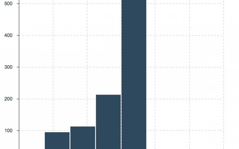
Let’s start with histograms, which give us an overview of all the possible values of a numerical variable of interest, as well as how often they occur. Simple yet powerful, histograms are sometimes called data distributions.
In visual terms, we draw a frequency table where the variable of interest is binned into ranges on the x-axis and where we show the frequency of the values in each bin on the y-axis.
For example, imagine a company makes its intelligent thermostats more attractive to consumers by offering rebates that vary by zip code. A histogram of the thermostatic rebates helps to understand its range of values, as well as how frequent each value is.
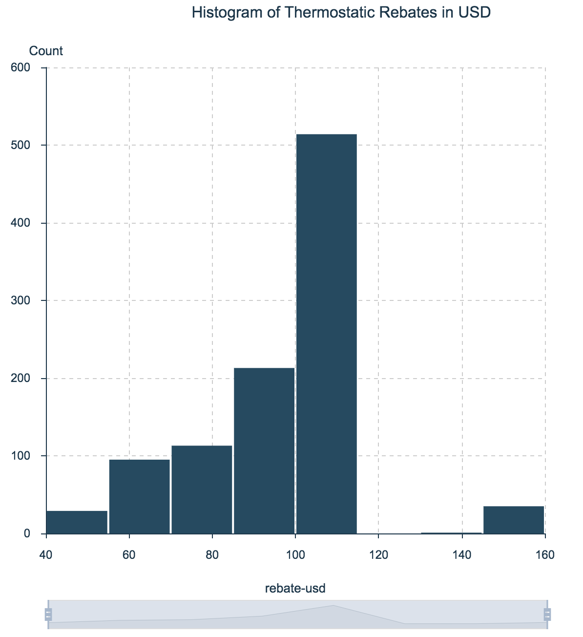
Histogram of Thermostatic Rebates in USD
Note that about half of the thermostat rebates were between $100 and $120. Only a handful of zip codes have rebates over $140 or under $60.
Data source here.
Bar and Pie Charts
Bar (and pie) charts are to categorical variables what histograms are to numerical variables. Both bar and pie charts work best for distributions of variables that can take only a fixed number of values, such as low/normal/high, yes/no, or regular/electric/hybrid.
Bar or pie? It is important to know that bar charts often can be inaccurate visually. Human brains are not particularly good with processing pie charts (read more about this in this article¹).
Too many categories can cause either bar or pie charts to overwhelm the visualization. In that case, consider choosing the top N values and visualize only those.
The next example shows both bar and pie charts for medical patients’ blood pressure, by the categories LOW, NORMAL and HIGH.
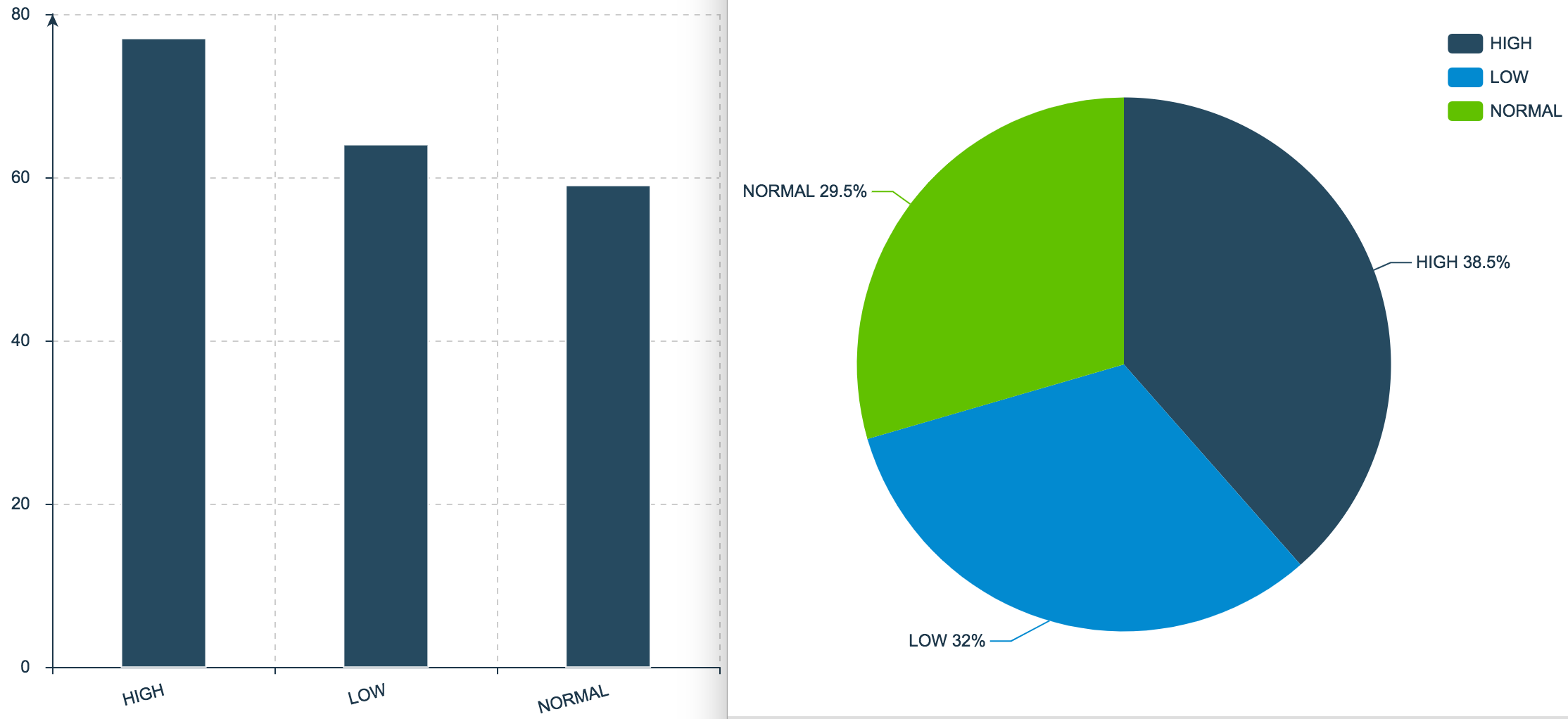
Bar and Pie Charts for Patient’s Blood Pressure
Data source here.
Scatter and Line Plots
Probably, the simplest charts are scatter plots. They show a two-dimensional (x,y) representation of the data on a cartesian plane, and are especially helpful for inspecting the relationship between two variables, because they let the viewer explore any correlations visually. Line plots are scatter plots but with a line that joins all the dots (frequently used when variable y is continuous).
For example, assume you want to explore how a house’s price relates to its square footage. The next figure shows a scatter plot with house prices on the y-axis and square footage on the x-axis. Note how the plot shows a level of linear correlation between the variables — in general, the more square footage, the higher the price.
I especially like scatter plots because you can extend their dimensionality with color and size. For instance, we could add a third dimension by coloring the dots according to the number of bedrooms in each house.
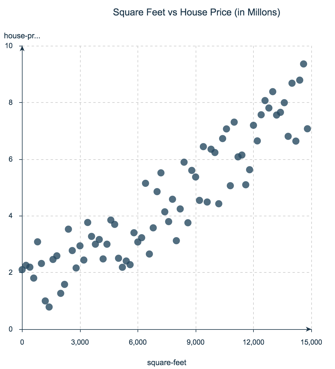
An easy way to extend scatter plots to 3 or 4 dimensions is to use the color and the size of the bubbles. For instance, if each bubble in the last plot is colored by the number of rooms in each house, we would have a third dimension represented in the chart.
Data source here.
Time Series Plots
Time plots are scatter plots with a time range on the x-axis where each dot forms part of a line — reminding us that time is continuous (though computers aren’t).
Time series plots are great for visually investigating trends, jumps and dumps in data over time, which makes them especially popular for financial and sensor data.
Here, for example, the y-axis represents the daily close price of Tesla stock from 2015 to 2017.
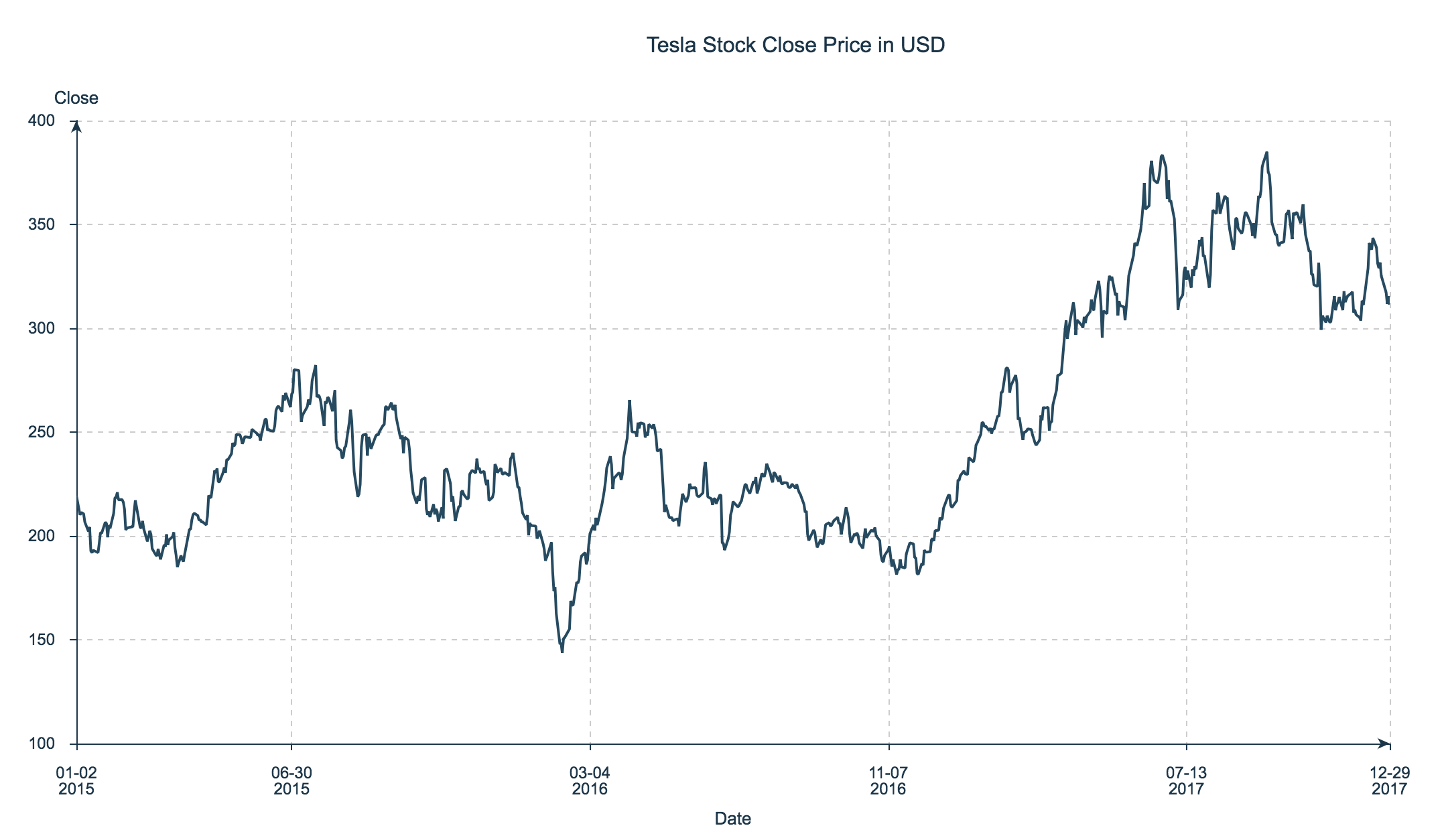
Time Series Plot of Tesla Stock Close Price from 2015–2017
Data source here.
Relationship Charts
If your goal is to develop a comprehensive hypothesis, it can be especially helpful to visually represent the relationships in your data. Imagine you’re a resident scientist at a healthcare company, working on a data science project for helping medical doctors accelerate their prescription decisions. Suppose there are four drugs (A, C, X and Y) and that doctors prescribe one and only one drug to each patient. Your data set includes historical data of patients prescriptions accompanied by patients’ gender, blood pressure and cholesterol.
How are relationship charts interpreted? Each column in the dataset is represented with a different color. The thickness of the lines in the charts represent how important (frequency count) a relationship is between the values of two columns. Let’s look at the example to dig into the interpretation.
A relationship chart of drug prescriptions offers a few insights:
• All patients with high blood pressure were prescribed Drug A.
• All patients with low blood pressure and high cholesterol level were prescribed Drug C.
• None of the patients prescribed Drug X showed high blood pressure.
With those intriguing insights in hand, you can start to formulate a set of hypotheses — and launch new areas of inquiry. For example, a machine learning classifier might work accurately to predict the usage for Drugs A, C and maybe X, but since Drug Y is tied to all the possible feature values, you might need additional features to begin making predictions.
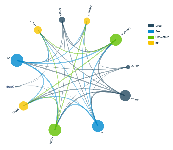
Patient Drug Prescription Relationship Chart
Data source here.
Heat Maps
Another cool and colorful way to bring an additional dimension to a 2-D plot is via heat maps, which use color within a matrix or map display to show frequency or concentration. Most users find heat maps especially intuitive since the color concentration pulls out trends and regions of special interest.
The following image shows a visualization of the Levenshtein distances between movie titles within the IMDB database. The further each movie title is from other titles, the darker it appears in the chart, for example (in terms of Levenshtein distance) Superman is far from Batman Forever, but close to Superman 2.
Credit for this great visualization goes to Michael Zargham².
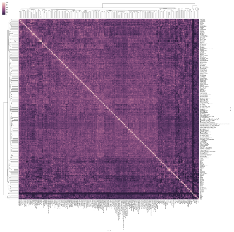
Heat Map of Distances Between Movie Titles
Maps
Like most people, I love maps and can spend hours in apps that use maps to visualize interesting data: Google Maps, Zillow, Snapchat, and more. If your data includes longitude and latitude information (or another way to organize data geographically (zip codes, area codes, county data, airport data, etc.) maps can bring a rich context to your visualizations.
Consider the thermostat rebate example from the earlier Histogram section. Recall that the rebates vary by region. Since the data includes longitude and latitude information, we can display the rebates on a map. Once I assigned a color spectrum from lowest rebate (blue) to highest rebate (red), I could lay the data onto a map of the States:
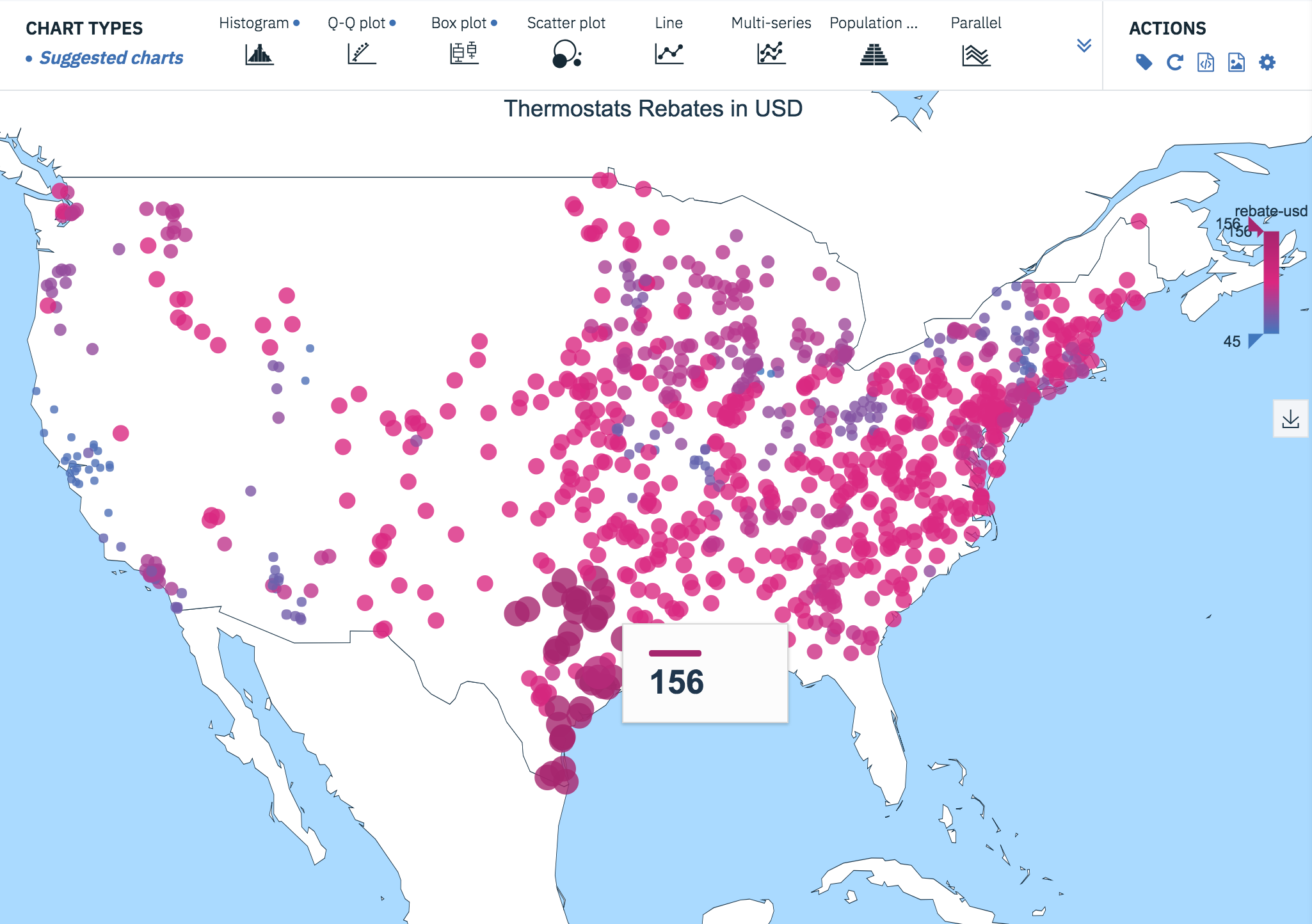
Thermostats Rebates in USD
Data source here.
Word Clouds
A surprising amount of data available for study occurs as simple free text. As a first pass on this data, we might want to visualize word frequency in the corpus, but histograms and pie charts really do best with frequencies in data that’s numerical rather than verbal. So we can turn instead to word clouds.
With free text data, we can start by filtering out stop words like “a,” “and,” “but,” and “how,” and by standardizing all text to lower case. I often find that there’s additional work to do to clean and shape the data, depending on your goals, including removing diacritical marks, stemming, and so on. Once the data is ready, it’s a quick step to use a word cloud visualization to get a sense of the most common words in the corpus.
Here, I used the Large Movie Reviews Dataset³ to draw a word cloud for the positive reviews and another for the negative reviews.
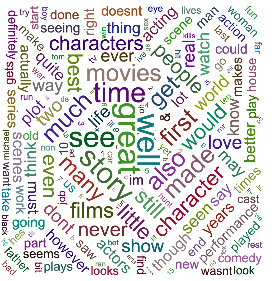
Word Cloud From Positive Movie Reviews
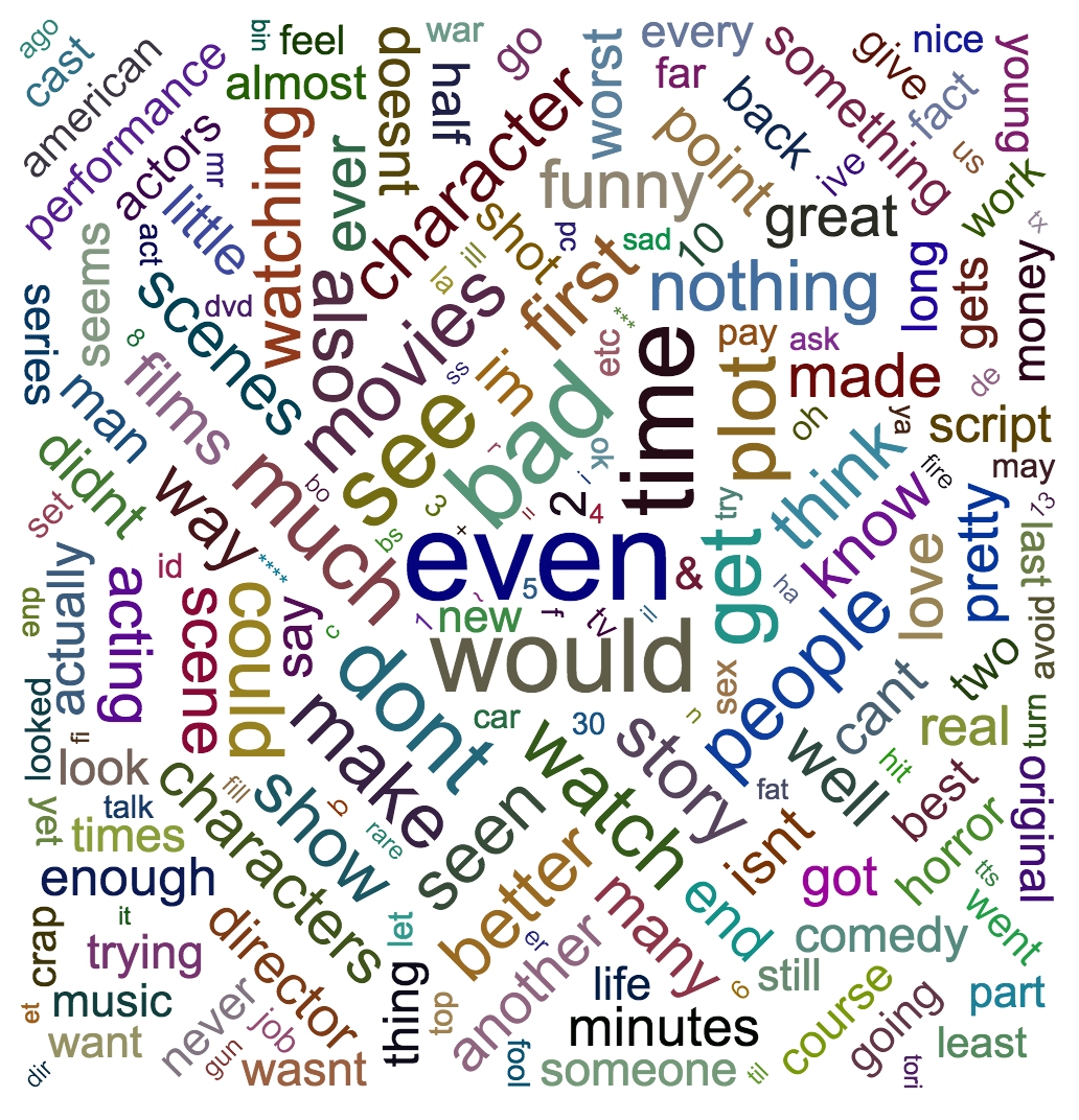
Word Cloud From Negative Movie Reviews
3-D Plots
It’s becoming increasingly common to visualize 3-D data by adding a third dimension to a scatter plot. These charts typically benefit from interactivity since rotation and resizing can help the user get meaningful views of the data. The next example shows a 2-dimensional Gaussian probability density function, along with a panel of controls for adjusting the view.
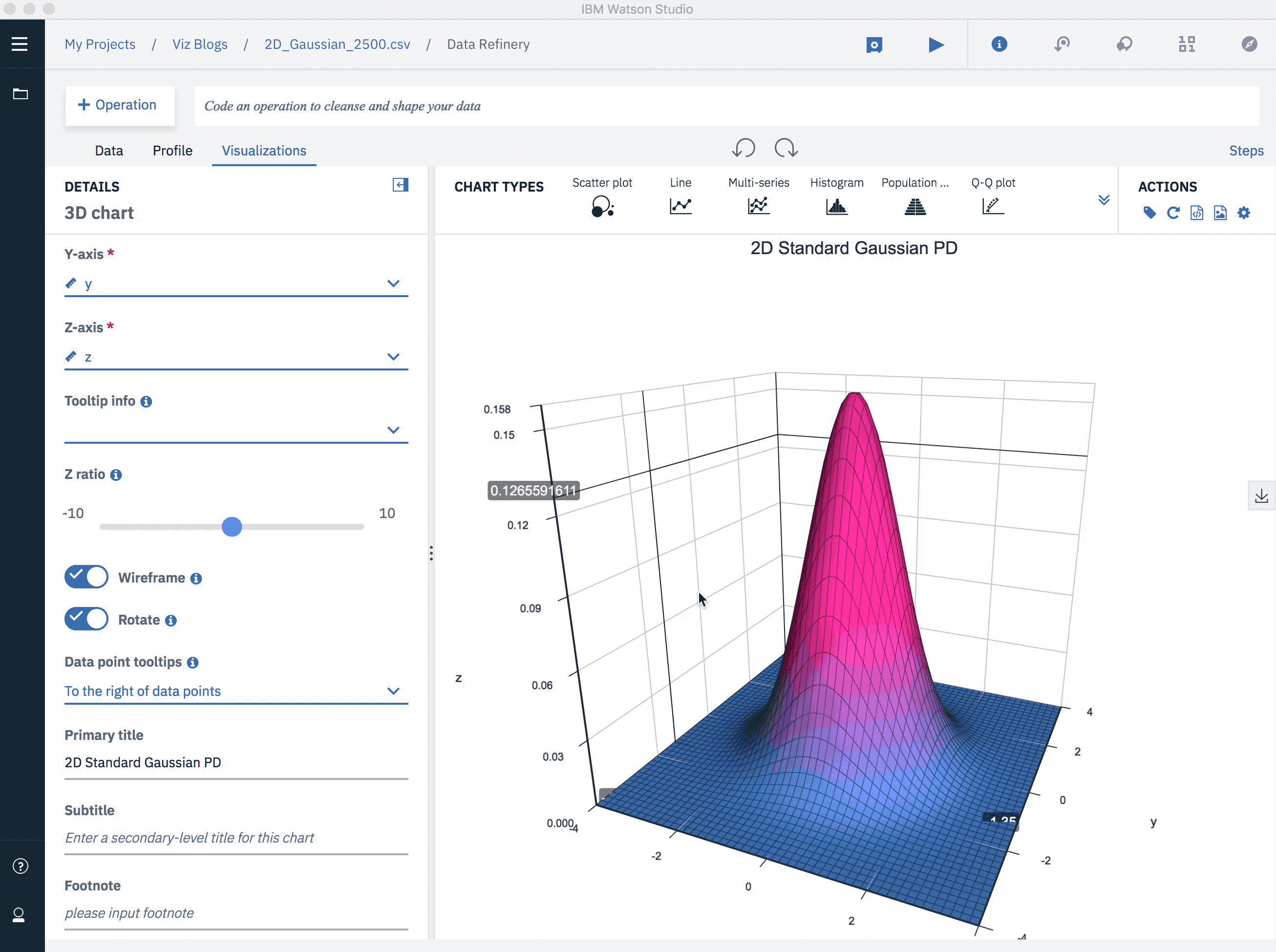
2D Gaussian Probability Density Function
Data source here.
Higher Dimensional Plots
With high-dimensional data, we want to visualize the influence of four, five, or more features at one. To do so, we can first project to two or three dimensions, taking advantage of any of the visualization techniques mentioned earlier. For example, imagine adding a third dimension to our thermostat rebate map where each dot were extended into a vertical line that indicated the average energy consumption for that location. Doing so would get us to four dimensions: longitude, latitude, rebate amount, and average energy consumption.
For higher-dimensional data, we often need to reduce the dimensionality using either principal component analysis (PCA) or t-Stochastic Neighbor Embedding (t-SNE).
The most popular dimensionality reduction technique is PCA, which reduces the dimension of the data based on finding new vectors that maximize the linear variation of the data. When the linear correlations of the data are strong, PCA can reduce the dimension of the data dramatically, with little loss of information.
By contrast, t-SNE is a non-linear dimensionality reduction method, which decreases the dimension of the data while approximately preserving the distance between data points in the original high-dimensional space.
Consider this small sample of MNIST⁴ database of handwritten digits. The database contains thousands of images of digits from 0 to 9, which researchers use to test their clustering and classification algorithms. The size of these images is 28 x 28 = 784 pixels, but with t-SNE, we can reduce those 784 dimensions to just two:
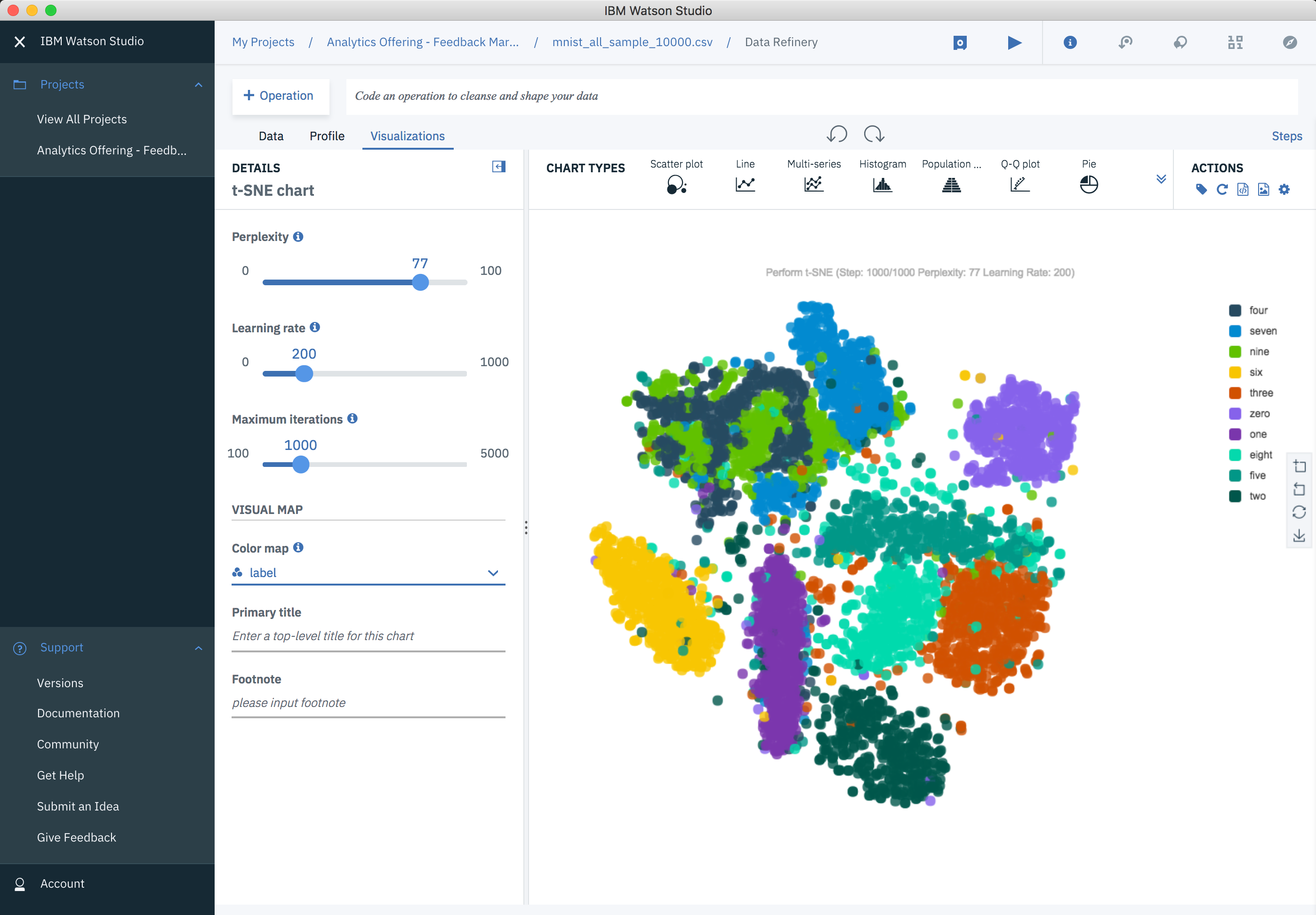
t-SNE on MNIST Database of Handwritten Digits
Data source here.
So there you have the ten most common visualization types with meaningful examples for each one. All the visualizations of this blog were done using Watson Studio Desktop. Besides Watson Studio Desktop, definitely consider tools like R, Matplotlib, Seaborn, ggplot, Bokeh, and plot.ly — to mention just a few.
And best of luck bringing your data to life!
[1] Stephen Few. (August 2007). “Save The Pies For Dessert”. https://www.perceptualedge.com/articles/visual_business_intelligence/save_the_pies_for_dessert.pdf
[2] Michael Zargham, and Jorge Castañón. (2017). A Physics-based Approach for a Data Science Collaboration. Medium Post.
[3] Andrew L. Maas, Raymond E. Daly, Peter T. Pham, Dan Huang, Andrew Y. Ng, and Christopher Potts. (2011). Learning Word Vectors for Sentiment Analysis. The 49th Annual Meeting of the Association for Computational Linguistics (ACL 2011).
[4] Yann LeCun and Corinna Cortes. (2010). MNIST handwritten digit database. Available at http://yann.lecun.com/exdb/mnist/
Special thanks to Steve Moore for his great feedback on this post.
Jorge Castañón, Ph.D.
Twitter: @castanan
LinkedIn: @jorgecasta
Please find the original blog post here.